
If you've ever felt like you're just throwing content at the wall and hoping something sticks on Twitter (now X), you're not alone. But what if you had a GPS that told you exactly where to go? That’s what Twitter Analytics is. It’s a free, surprisingly powerful tool that turns your confusing dashboard into a clear roadmap for growth.
This guide will show you how to stop guessing and start making smart decisions that actually move the needle.
Why Twitter Analytics Is Your Secret Weapon for Growth

Most people post content and cross their fingers—a strategy that’s basically shouting into the void. Twitter Analytics flips that script. It’s the platform's own built-in tool that tells you the real story behind your performance.
It’s about moving past vanity metrics like likes and digging into what your audience is telling you with their actions. Who are they? Where do they live? What topics actually make them stop scrolling? This isn't about becoming a data scientist; it's about learning to listen.
From Guesswork to Growth
Let’s say you’re a B2B consultant. Your gut might tell you to post formal, jargon-heavy industry updates. But your analytics might slap you with a surprise: your most engaging content is actually the behind-the-scenes stories about your biggest business blunders.
That's the magic of a data-driven approach. It kills your assumptions with cold, hard facts and points your content strategy toward what genuinely works. Nail this, and you’re on your way to building a predictable growth engine for your account.
"Data beats opinion. Twitter Analytics provides the raw data you need to stop guessing and start building a content strategy that consistently delivers engagement and audience growth."
The Core Benefits of Using Analytics
When you make checking your analytics a regular habit, you start to unlock some serious advantages. For anyone who's serious about building a real presence on the platform, these aren't just nice-to-haves; they're essential.
- Audience Understanding: Get the real scoop on your followers' demographics, interests, and locations so you can finally speak their language.
- Content Optimization: Pinpoint your top-performing tweets to see which formats (threads, polls, videos) and topics get the most traction. Double down on what works.
- Strategic Decision-Making: Use hard data to figure out the best times to post, fine-tune your calls-to-action, and stop wasting time on stuff that goes nowhere.
- Follower Growth Insights: See which specific tweets led to a jump in followers, giving you a repeatable formula for learning how to grow your Twitter following more effectively.
Bottom line: mastering the information in your dashboard is non-negotiable for real, sustainable growth. The platform will change, algorithms will shift, but the core principle of understanding your audience through data will always be king. This guide will walk you through it, step-by-step.
Alright, let's get you set up with your Twitter Analytics dashboard. This is your first real step toward building a data-driven strategy, and honestly, it’s where the magic happens.
Think of it like the instrument panel in a car. It might look a little intimidating at first glance, but once you know what each dial means, you’ll wonder how you ever managed without it.
First things first, you’ll need to be on a desktop browser. The mobile app only gives you a tiny peek at post-by-post stats, but the full-blown dashboard is where you'll find the real insights.
Getting Into Your Dashboard
Finding your way to the main analytics panel is pretty straightforward. While X has some premium features, the core dashboard is usually accessible to everyone and packed with valuable information.
- Head over to analytics.twitter.com in your browser and log in.
- Or, from your main X feed, click the More option (the three little dots in the left-hand sidebar).
- A menu will pop up. Select Creator Studio, then click on Analytics.
Boom, you're in. You’ll land on the main account homepage, which gives you a high-level overview of your performance, usually summarized over the last 28 days. This is your mission control—a quick snapshot of performance highlights and month-over-month changes.
Think of this initial view as a quick health check. It shows you key trends in impressions, follower changes, and overall engagement without burying you in the details just yet.
How the Dashboard is Laid Out
The dashboard is broken down into a few key areas that let you look at your performance through different lenses. While the main account home gives you that 28-day summary, the real power comes from digging into your individual posts.
By hopping between the tabs and playing with the filters, you can go from a broad overview to a super-granular analysis of what’s actually working. This is a non-negotiable skill for anyone serious about their X strategy.
A classic mistake is just glancing at the 28-day summary. The gold is hidden in the Tweet activity tab. That’s where you can pinpoint the exact content pillars that get your audience talking.
Exporting Your Data for a Deeper Dive
One of the most powerful (and underused) features in the dashboard is the ability to export your data. This is how you break free from the platform's limitations and run a truly custom analysis.
Look for the "Export data" button in the upper-right corner of the Tweet activity page. This lets you download a CSV file with detailed metrics for every tweet within a date range you choose.
- By Tweet: This export is a goldmine. It gives you a row-by-row breakdown of every single tweet, showing impressions, engagements, retweets, replies, likes, and link clicks.
- By Day: This option gives you a daily summary of your aggregate metrics, which is great for spotting broader trends over time.
Exporting your data is essential for creating custom reports, identifying long-term content trends, or doing a full-blown content audit. For example, you can open that spreadsheet and sort it by "Engagement rate" to instantly see your top-performing content. From there, you just have to look for patterns. This hands-on approach is what separates passive observers from strategic pros.
The Key Twitter Metrics That Actually Matter
Diving into your Twitter analytics can feel like trying to read another language. Numbers are flying everywhere, but what do they actually mean for your strategy? Let's translate that data into a story you can understand and act on.
We're going to move beyond simple definitions to get to the "so what" behind each key metric. Think of it this way: your data is telling a story about what your audience wants, and your job is to learn how to read it.
This little concept map gives you a high-level view of how your dashboard takes raw tweet activity and organizes it into useful summaries and audience insights.
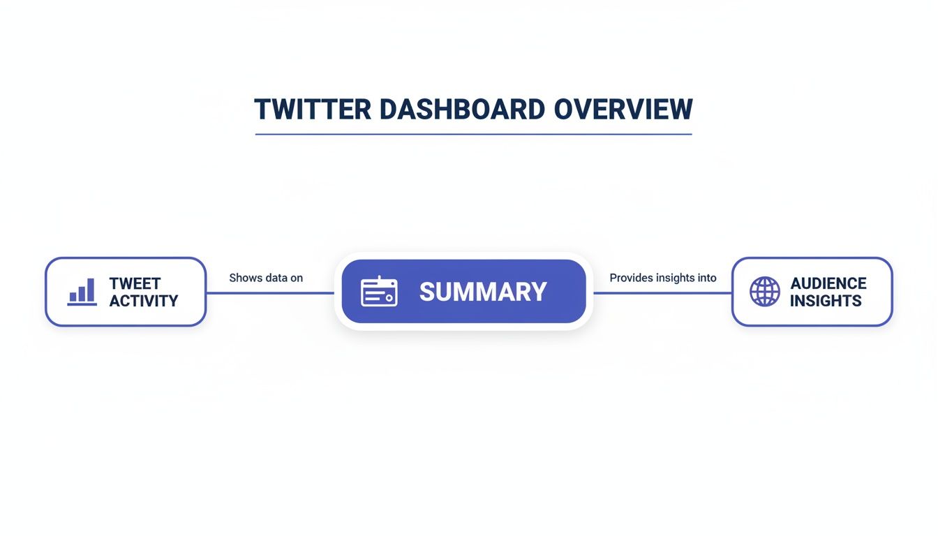
As you can see, everything starts with individual tweet performance. That's the foundation for understanding the bigger picture of your account's health and your audience's behavior.
To make this easier, here’s a quick-reference table that breaks down the essential metrics you'll find in your dashboard. It covers what each one measures and, more importantly, what it tells you about your performance.
Key Twitter Analytics Metrics at a Glance
| Metric | What It Measures | Why It Matters for Your Strategy |
|---|---|---|
| Impressions | The total number of times your tweet was displayed to a user. | Your basic measure of reach. High impressions mean the algorithm is showing your content, but it doesn't guarantee people are paying attention. |
| Engagements | The total number of times a user interacted with your tweet (likes, replies, link clicks, etc.). | This shows your content was compelling enough to make someone stop scrolling and act. It’s a direct signal of audience interest. |
| Engagement Rate | The percentage of impressions that resulted in an engagement. (Engagements ÷ Impressions) | The ultimate test of content quality. It tells you how well your content resonates, regardless of how many people saw it. |
| Link Clicks | The number of times users clicked a URL in your tweet. | Crucial for measuring traffic-driving goals. This metric directly tracks how well your call to action is working. |
| Profile Visits | The number of times users clicked your profile name, handle, or picture from your tweet. | A strong indicator of deeper interest. It’s often the step right before someone decides to follow you, making it key for follower growth. |
Now that you have the cheat sheet, let's dig into what each of these really means for your day-to-day Twitter strategy.
Impressions: The Billboard on the Highway
Impressions count every single time your tweet is shown to a user. It’s the most basic measure of visibility you have.
Imagine you’ve put up a billboard on a busy highway. Impressions are the total number of cars that drove past it. They didn't necessarily read it or call the number, but they had the chance to see it. High impressions are a good sign the algorithm is putting your content in front of people.
But be careful—impressions alone don't tell the whole story. A tweet can rack up 100,000 impressions and have zero meaningful impact if no one actually acts on it. Think of this metric as your starting point for reach, not the finish line.
Engagements: The People Who Took Action
Engagements are the total number of times a user interacted with your tweet. This bundles a whole bunch of different actions into one number.
If impressions are the cars driving by your billboard, engagements are the people who actually slowed down, read the message, and maybe even called the number. This is where you find out if your content was interesting enough to make someone stop scrolling and do something.
What counts as an engagement?
- Likes: A quick nod of approval.
- Replies: Someone cared enough to start a conversation.
- Retweets (Reposts): Your content was valuable enough to share.
- Link Clicks: You sparked enough curiosity to earn a click.
- Profile Clicks: Your tweet made someone want to learn more about you.
This collection of actions is way more valuable than impressions because it signals genuine interest from your audience.
Engagement Rate: The True Test of Resonance
The Engagement Rate is arguably the most important metric in your entire analytics dashboard. It measures the percentage of people who saw your tweet and actually chose to engage with it.
The formula is simple: (Total Engagements ÷ Total Impressions) x 100. This number cuts through the noise of vanity metrics. A tweet with only 1,000 impressions but a 5% engagement rate is often far more successful than a tweet with 50,000 impressions and a 0.5% rate. Why? Because it proves your message hit the mark with the audience who saw it.
A high engagement rate tells the algorithm that your content is valuable, which often leads to even greater reach. It’s the ultimate feedback loop for content quality.
A "good" engagement rate varies by industry, but anything over 1% is generally considered solid. If you're consistently hitting 2-3% or higher, you've got a highly connected and interested audience.
Link Clicks: Measuring Your Call to Action
Link Clicks are as straightforward as they sound: they count how many times users clicked on a URL in your tweet. This metric is absolutely critical if your goal is to drive traffic to a blog, a product page, or any off-platform destination.
This is the metric that directly measures your ability to move your audience from Twitter to your own digital turf. If your link clicks are low, it’s a clear signal that your call-to-action (CTA) isn't compelling enough or the value you're offering on the other side of that click isn't clear.
Profile Visits: A Sign of Deeper Interest
Profile Visits measure how many people clicked on your username, handle, or profile picture to check out your main profile page. This is a powerful indicator of genuine interest.
A profile visit means your tweet was so compelling that it made someone ask, "Who is this person?" This action is often the step right before a user decides to follow you. If your main goal is follower growth, a steady stream of profile visits is a fantastic sign that your content is attracting the right kind of people.
How to Turn Raw Data Into a Winning Strategy

Knowing what your Twitter metrics mean is a great start, but it's only half the battle. The real magic happens when you connect the dots and turn those raw numbers into a smarter, more effective content strategy. After all, data is only useful when you actually do something with it.
Think of your analytics dashboard as a pile of puzzle pieces. Each number—an impression, a like, a click—is just one piece of a bigger picture. Your job is to assemble them until you see a clear image of what your audience truly wants.
Let's walk through how to stop guessing and start building a content plan based on cold, hard proof of what works.
Uncovering Patterns in Your Top-Performing Tweets
The fastest path to a better strategy is hidden in your own feed. Your top-performing tweets are a goldmine of information, showing you exactly what resonates with your audience. Exporting your data into a spreadsheet is the best way to tackle this, as it lets you sort your content by key metrics like Engagement Rate or Impressions.
Once you have your data sorted, isolate your top 5-10 tweets from the last month or so. Now, play detective and look for the common threads. You're not searching for a single silver bullet, but for repeatable themes and formats that your audience consistently loves.
Start by asking these simple questions about your best content:
- What topics are hitting home? Are people responding to industry news, personal stories, or step-by-step tutorials?
- Are questions outperforming statements? Does asking for opinions reliably spark more replies and conversation?
- Which formats get the most love? Do text-only posts win, or do threads, polls, or videos get better engagement?
- When are these top tweets going live? You might find a sweet spot for posting you never would have guessed.
Answering these questions turns your analytics from a simple report card into a powerful playbook for everything you create next.
Conducting a Simple Content Audit
With these new insights, it's time for a quick content audit to sharpen your strategy. This is all about categorizing what works, what doesn't, and where you should experiment next.
Think of it like cleaning out your closet. You need to decide what to keep, what to get rid of, and what new styles to try based on what you actually wear and feel good in.
A content audit isn't about judging past performance; it's about learning from it. Every "failed" tweet is just a data point telling you what your audience doesn't want, which is just as valuable as knowing what they do.
To get started, create three dead-simple categories based on your findings:
- "More Of" Content: These are your proven winners. The topics, formats, and tones that consistently crush it. Make these the foundation of your content calendar.
- "Less Of" Content: These are the posts that consistently fall flat—low impressions, even lower engagement. Be ruthless. Cut them from your rotation to focus your energy where it counts.
- "Experimental" Content: This is your playground for testing new ideas based on what you've learned. If you noticed questions do well, maybe you experiment with a weekly Q&A poll.
This simple framework gives you immediate clarity on what to do next. For an even deeper dive, our guide on essential social media marketing tips can help you structure those experiments for maximum impact.
Real-World Example: A Consultant's Breakthrough
Let’s make this real. A B2B consultant was posting daily industry news and technical tips, but her engagement rate was stuck below 1%. She felt like she was shouting into the void.
Frustrated, she exported her last three months of data. As soon as she sorted by engagement rate, a shocking pattern jumped out. Her top three posts had nothing to do with industry news. They were personal, vulnerable anecdotes about overcoming business challenges.
One tweet about a failed client pitch, in particular, had tripled her average engagement and triggered a flood of supportive replies. The data couldn't have been clearer: her audience of fellow entrepreneurs was starving for authenticity, not just another news link.
That single insight changed everything. She dialed back the generic news and committed to sharing one personal story or lesson learned each week. Her engagement shot through the roof, and more importantly, she started building a genuine community.
Once you know what connects with your audience, you can get creative by mastering tweet to image conversion for engagement to make your best ideas even more compelling.
This story really drives home a crucial point. As the platform evolves, the premium on posts that create an immediate connection has never been higher. A data-driven approach, like the one our consultant took, is no longer a nice-to-have—it’s essential for anyone who wants to stand out.
Using Analytics to Reach a Global Audience
It’s easy to fall into the trap of thinking your followers are just like you, living in the same city or time zone. But a quick peek into your Twitter analytics often tells a very different story. Your audience is almost certainly more spread out than you think, and that’s a massive, untapped opportunity just waiting for you.
When you dive into your Audience Insights, you'll find a geographic breakdown of where your followers live. Think of it as stumbling upon a new, eager market that was right under your nose the whole time. You might just find a huge cluster of followers in a country you never even considered.
This single piece of data can completely flip your content strategy on its head. It’s the key to shifting from a local mindset to a global one, allowing you to connect with people no matter where they are in the world.
Adjusting Your Content for Different Time Zones
So, what’s the first, most powerful thing you can do with this location data? Optimize your posting times.
Let's say you're based in New York, but your analytics reveal that 30% of your audience is in the United Kingdom. If you’re only tweeting during your 9-to-5, you’re completely missing their peak engagement window. They're asleep when you're most active.
This is such a simple fix, but the payoff is huge. Schedule a few key tweets to go live when your UK audience is scrolling—maybe during their morning commute or lunch break. You're meeting them where they are, on their time, and that simple shift can dramatically boost your reach.
Tailoring Your Message for Key Markets
Knowing where your audience lives also helps you craft messages that actually resonate. The platform's user base isn't evenly distributed; it’s highly concentrated in a few key regions. For example, the United States leads with up to 111 million users, with Japan close behind at around 75 million. India, Indonesia, and the UK are also major players, each with tens of millions of users. You can get a better feel for the landscape by exploring these Twitter user statistics.
This data gives you clues about the cultural contexts your followers are living in. If a big chunk of your audience is in Japan, you might think about how your jokes or references translate. If you have a strong US following, mentioning local holidays or events can build a much stronger connection.
Discovering a pocket of followers in an unexpected region is like finding a new revenue stream. It’s an audience that’s already interested—all you have to do is start the conversation.
Growing Your International Community
Building a global following is about more than just scheduling posts. It's about creating a sense of community that doesn't care about borders. Once you spot a growing audience in a specific country, you can start making them feel seen.
- Acknowledge Them: Seriously, a simple "Good morning to all our followers in Brazil!" can make people feel included and valued.
- Ask Relevant Questions: Frame questions that invite international points of view. This makes your replies way more diverse and interesting for everyone.
- Monitor Global Trends: Keep an eye on what’s trending in the regions where your followers are. Jumping into those conversations (authentically, of course) can give your visibility a serious boost.
Using your analytics to guide these small efforts is how you intentionally build an inclusive and engaged global community. This is foundational to a solid community marketing strategy on Twitter, transforming passive followers into active members of your tribe. The insights are right there in your dashboard, just waiting to be used.
Answering Your Top Twitter Analytics Questions
Getting started with a new tool always brings up questions, so let’s tackle the most common ones I hear about Twitter Analytics. Think of this as your go-to FAQ for any hurdles you might hit.
We’ve pulled together the most frequent sticking points to give you clear, no-nonsense answers. Let's clear the fog so you can get back to building a smarter Twitter strategy.
How Often Should I Check My Twitter Analytics?
A weekly check-in is the perfect place to start. It gives you enough data from the past seven days to spot trends without getting lost in the daily ups and downs. This rhythm is great for reviewing what worked last week and making small tweaks for the next.
Beyond that, I recommend a deeper monthly review. This is where you zoom out to see the bigger picture, analyze broader patterns, and make those key strategic decisions for your content calendar. Avoid checking daily—it's a surefire way to overreact to normal, minor dips and spikes in your data.
Why Are My Impressions High but Engagement Is Low?
Ah, the classic question. If you’re seeing this, it means your tweets are reaching people's feeds, but they aren't compelling enough to make them stop scrolling and take action. It could be a weak hook, a missing call-to-action, or the topic just isn't hitting the mark for your audience right now.
This isn't a failure—it's a valuable data point. High reach with low engagement is a clear signal to refine your messaging or format, not your visibility strategy.
Take a hard look at the tweets where this is happening. Are they all just statements without questions? Do they lack visuals? Try mixing things up. Run a poll, ask for opinions, or add an engaging video or GIF to encourage that all-important interaction.
Can I See Analytics for Another Twitter Account?
Nope, not directly. You can only access the detailed, native Twitter Analytics dashboard for accounts you own or have been given access to. There’s no way to peek behind the curtain at another user's private analytics.
However, you can use third-party social media tools to get high-level performance estimates for any public account. While it won't be the same granular data, it’s incredibly useful for a bit of competitor analysis or benchmarking your performance against others in your space.
Does Twitter Analytics Track Clicks on My Profile Bio Link?
This is a big one: native Twitter Analytics does not track clicks on the URL in your bio. It's a critical limitation to be aware of. The platform only registers link clicks that happen within your individual tweets.
To see how much traffic your bio is actually driving, you'll need another tool. Use a URL shortener like Bitly that has its own analytics, or add UTM parameters to your link. You can then track those UTMs in your website's analytics platform (like Google Analytics) to get a crystal-clear view of the traffic coming from your profile.
Ready to stop guessing and start posting with confidence on professional networks? PostFlow helps you turn your ideas into consistent, high-impact content.
Let Emilia, your AI content strategist, build your LinkedIn presence today.