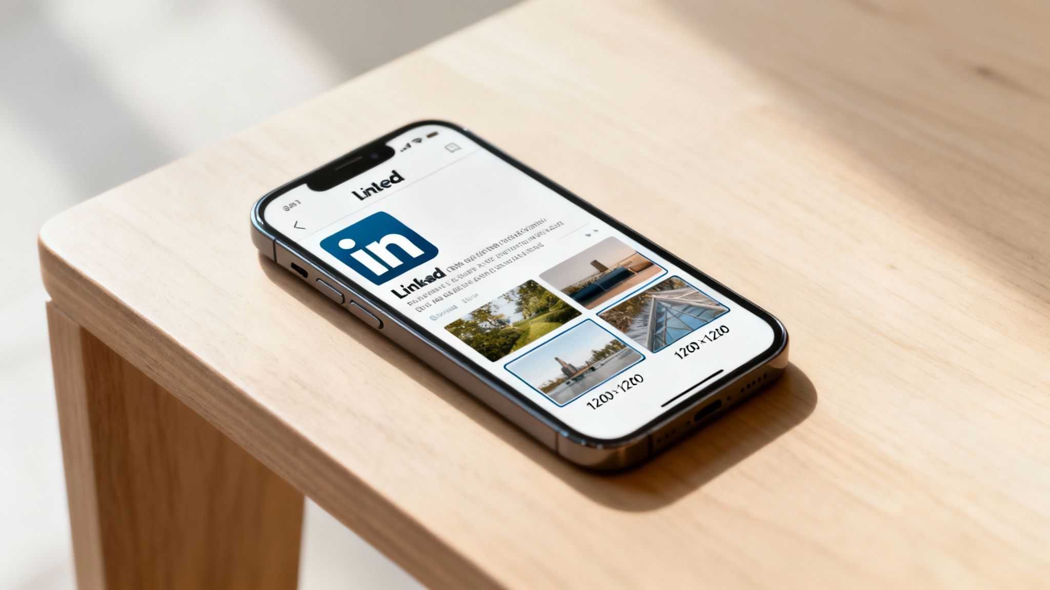
When it comes to LinkedIn, getting your image sizes right isn’t just a nice-to-have; it’s absolutely essential for making a professional impact. The sweet spot for a standard image post is a clean 1200 x 1200 pixels (that’s a 1:1 square ratio), but for a link preview, you’ll want to use 1200 x 627 pixels (a 1.91:1 landscape ratio).
Nailing these dimensions is the difference between a post that looks sharp and one that gets awkwardly cropped or looks blurry.
Your Quick Reference for LinkedIn Image Sizes
Let's be honest, in a feed full of professionals, your visuals are your first handshake. An image that’s sized incorrectly can completely undermine your message and make your content look unprofessional. It’s a small detail that has a huge impact on engagement and click-through rates.
This section is your go-to guide for the most important LinkedIn image dimensions. Whether you're dropping a single graphic, a carousel, or a link to your latest article, having these specs handy will save you time and make sure your content always looks polished. Think of it as step one in a solid content strategy.
And for more quick wins, our one-minute LinkedIn optimization checklist is packed with other simple tweaks you can make.
Core Post and Link Dimensions
For a standard image post, stick with 1200 x 1200 pixels. The 1:1 square aspect ratio simply performs best, taking up prime real estate in the feed on both desktop and mobile. It just commands attention.
When you’re sharing a link, the game changes. The best preview image size is 1200 x 627 pixels, which gives you a 1.91:1 landscape ratio. This ensures the visual that accompanies your link fits perfectly without any weird cropping.
This infographic breaks down the two most common image types at a glance.
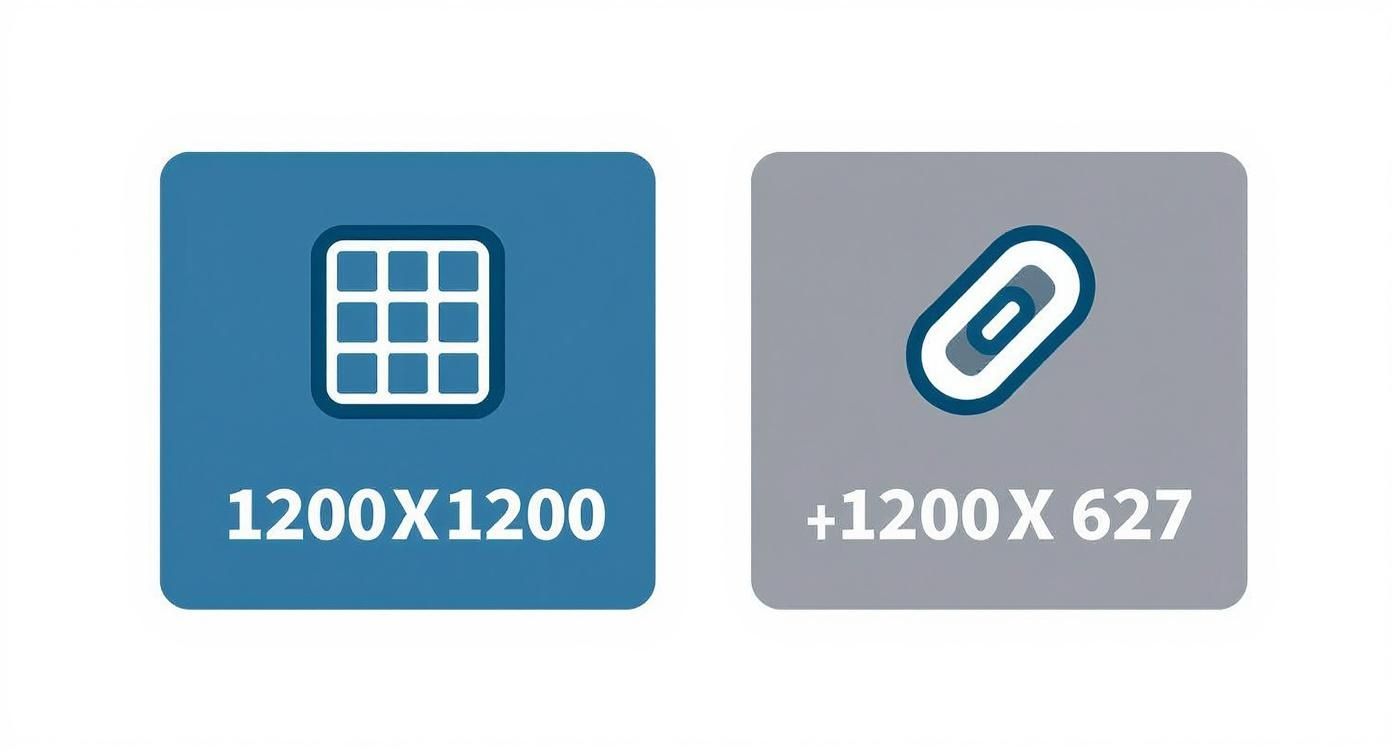
As you can see, there’s a clear difference: the square format is built for direct engagement, while the wider landscape format is designed to drive traffic from links. If you want to dive deeper into optimizing visuals across all social platforms, check out this complete guide to social media image dimensions.
Getting Your Profile and Company Page Images Right
Think of your LinkedIn profile and company page as your digital storefront. Your images are the first thing people see, making them your single most important first impression. If you get the dimensions wrong, you risk looking sloppy and unprofessional. Nailing these core visuals is the bedrock of your brand on the platform.
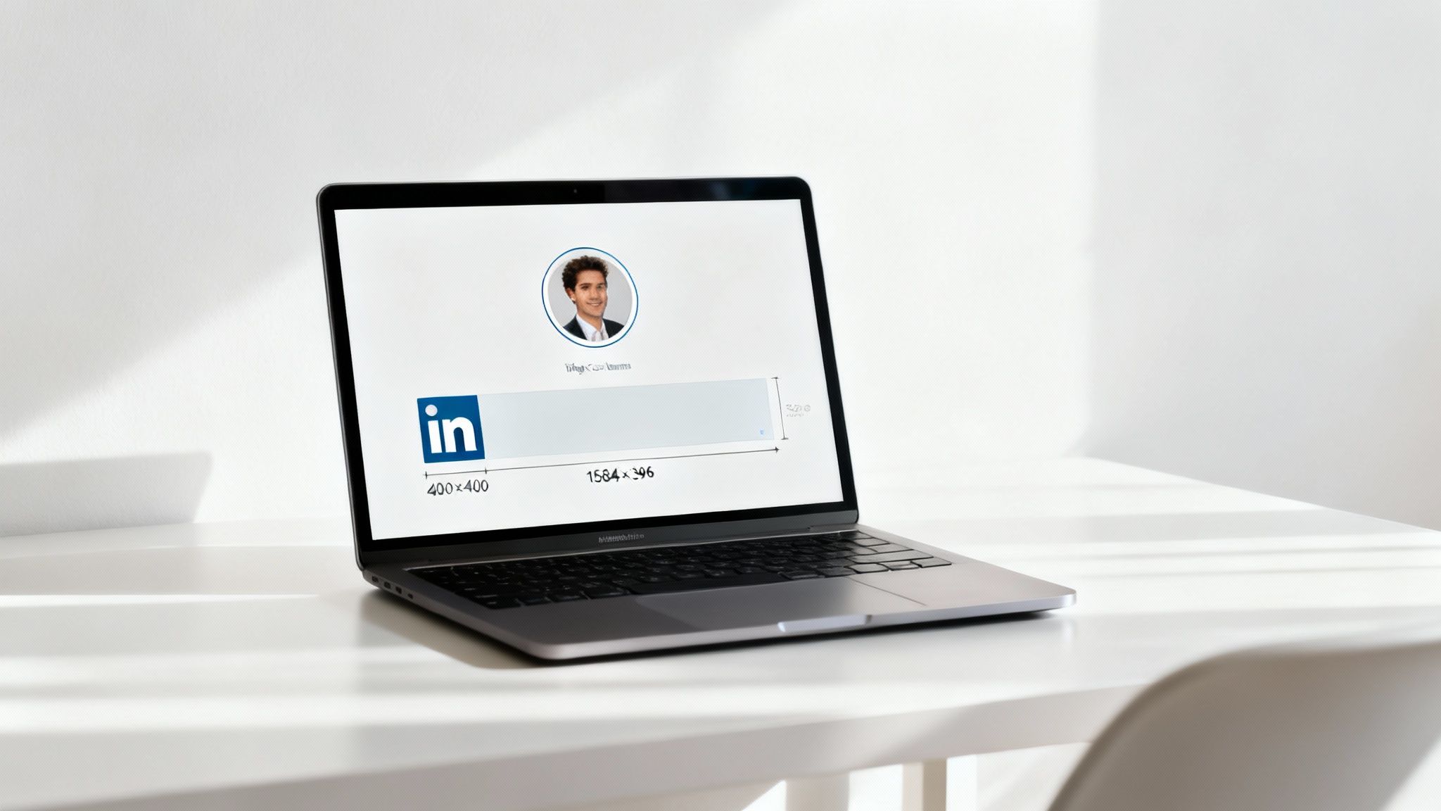
Your personal profile picture is easily your most visible asset—it shows up next to every single post, comment, and message you send. The sweet spot for a sharp profile picture is 400 x 400 pixels. Keep in mind, while you upload a square, LinkedIn will crop it into a circle. That means you need to center your face and make sure no important details get lopped off in the corners. The square is your canvas, but the circle is the final frame.
Your personal background photo (or cover photo) is a huge piece of real estate to show off your professional brand. The ideal dimensions here are 1584 x 396 pixels, which gives you a wide 4:1 aspect ratio. This is your chance to highlight your expertise, feature a project, or just communicate what you're all about. Just be aware that on desktop, your profile picture will cover up a small part of it.
Nailing Your Company Page Visuals
The same rules apply to company pages—your logo and cover image are just as foundational. The recommended size for a company logo is 300 x 300 pixels, though I often suggest uploading a 400 x 400 pixel version just to ensure it stays crisp across all devices. And just like your personal profile pic, this gets cropped into a circle, so a centered design is non-negotiable for brand consistency.
The company cover image is a little different from the personal one, sized at 1128 x 191 pixels to fit the page layout perfectly. This spot is prime for announcing events, showing off your company culture, or driving home your brand’s value proposition. A great cover photo can tell a potential client or new hire what your business is all about in a single glance.
The key takeaway here is simple: both personal and company profiles need a combination of a perfectly centered square image (your profile pic or logo) and a wide, panoramic image (the cover photo) to build a strong visual identity.
Getting these core images right from the start makes everything else look polished and professional. Your profile image, at 400 x 400 pixels, creates a unified look, while the larger 1584 x 396 pixels cover photo (with its 4:1 aspect ratio) establishes your brand's presence. For a broader look at visual specs, you can find more details on social media image sizes in this helpful guide.
Nailing Your Single and Multi-Image Posts
When you're fighting for attention in the LinkedIn feed, getting your image dimensions right is non-negotiable. It's the difference between grabbing someone's attention and getting scrolled past. For single-image posts, you've got a couple of solid options, and the one you choose can seriously impact how your content lands.
The crowd favorite and my personal go-to is 1200 x 1200 pixels. This perfect 1:1 square aspect ratio is a workhorse—it takes up a generous chunk of screen real estate on both desktop and mobile, making your post pretty hard to ignore.
But don't sleep on vertical images. A portrait orientation can be a secret weapon, especially since most people are scrolling on their phones. For this, you'll want to use 1080 x 1350 pixels, which gives you a 4:5 aspect ratio. This taller format really fills up a mobile screen, creating a much more immersive look.
Single Image Post Recommendations
So, square or vertical? It really boils down to what you're posting. Square images are fantastic all-rounders for things like infographics, pull quotes, or big announcements. Vertical images, on the other hand, are killer for showing off detailed visuals or portraits.
Square (1:1 Ratio): Go with 1200 x 1200 pixels. This is your safest bet. It’s balanced, it looks great everywhere, and you never have to worry about weird, unexpected cropping. It's the definition of maximum compatibility.
Vertical (4:5 Ratio): Use 1080 x 1350 pixels. This is your mobile-first powerhouse. It commands more vertical space in the feed and is a proven scroll-stopper.
Mastering Multi-Image Carousel Posts
Carousels are an amazing way to tell a story or break down a complex idea, letting you combine multiple images into one swipeable experience. But here's the catch: LinkedIn automatically crops and arranges your images based on how many you upload, and if you're not ready for it, the results can be... awkward.
You have to think like a designer and understand how LinkedIn’s grid system works to build a visual narrative that flows. To keep things clean and avoid nasty surprises, your best bet is to make every single image in your carousel a 1:1 square (1200 x 1200 pixels).
A great carousel takes your audience on a journey, with each slide building on the last. If your image sizes are all over the place, it completely breaks that flow and kills your post's impact.
For instance, if you upload just two images, LinkedIn will jam them side-by-side, cropping them into vertical rectangles. A three-image post gets even funkier, with one large vertical image on the left and two smaller squares stacked on the right.
To build a carousel that looks polished and professional:
- Stick to One Aspect Ratio: Seriously, just use a 1:1 square ratio for every image. This gives you the most control and predictability.
- Design for the Crop: Know how LinkedIn is going to slice up your layouts. Always keep your most important text and visuals dead center so they don't get chopped off.
- Tell a Cohesive Story: Make sure your images connect logically. I love using little visual cues like arrows or numbered steps to guide people from one slide to the next.
Getting Link Preview Images Right Every Time
When you share a link on LinkedIn, you’re not just sharing a URL—you're making a first impression. A blurry, awkwardly cropped, or just plain wrong preview image can instantly tank your credibility. It makes your whole post look unprofessional and kills any chance of getting that click.
I've seen it happen a thousand times. A great post, undermined by a bad visual.
The only size you need to remember for link previews is 1200 x 627 pixels. This isn't a suggestion; it's the rule. This specific dimension gives you a 1.91:1 aspect ratio, a perfect landscape format that LinkedIn’s feed is built to handle beautifully on both desktop and mobile. Stick to it, and your image will look sharp, clear, and exactly how you designed it.
This means your preview image isn't just decoration; it's a core part of your post's performance. If you want to create trust-building LinkedIn preview images that actually convert, you have to go beyond just getting the dimensions right.
How LinkedIn Finds Your Preview Image
So, how does LinkedIn decide which image to show? It's not random. It’s looking for something very specific in your website's code: an Open Graph (OG) image tag.
This little snippet of code lives in the <head> section of your site’s HTML and explicitly tells social media platforms, "Hey, use this specific image for the preview." To make sure LinkedIn always grabs the right visual, you (or your web developer) need to set the og:image tag. It should look something like this: <meta property="og:image" content="https://yourwebsite.com/images/your-perfect-image.jpg" />.
If that tag is missing, LinkedIn will take its best guess—which usually means grabbing your logo or some other random image from the page. The result? An inconsistent, off-brand mess.
Troubleshooting Incorrect Preview Images
Ever shared a link, only to see an old, outdated, or totally wrong image pop up? It’s a common headache, but the fix is usually pretty simple. It's almost always a caching problem.
LinkedIn holds on to old information to load things faster, but you can force it to refresh its memory. Just use the official Post Inspector tool.
Here’s the quick fix:
- Go to the LinkedIn Post Inspector.
- Paste in the URL of the page you want to share.
- Click the "Inspect" button.
That's it. This tells LinkedIn to re-scrape your page, dump its old cache, and find the new og:image you’ve set. From then on, your link should show the correct, perfectly sized preview every single time.
Designing for Mobile and Desktop Experiences
Let's be honest: creating a LinkedIn image that looks incredible everywhere isn't just a nice-to-have anymore. It's essential. Your audience is scrolling on everything from massive desktop monitors to their phones while waiting for coffee, and your visuals have to hold up on all of them.
I've seen it happen countless times—a design that looks killer on a laptop completely falls apart on mobile. The core problem is that LinkedIn crops and resizes images unpredictably depending on the device. What seems perfectly framed on your screen might chop off the most important parts of your image in the mobile app. This is a huge issue for personal cover photos and multi-image posts, where the layout can shift dramatically.
Adopting a Mobile-First Mindset
With so much engagement happening on the go, designing for mobile first is really the only way to guarantee a solid brand experience. This isn't just a trend; it's a strategic shift backed by data. Mobile traffic on LinkedIn has jumped from around 30% in 2015 to well over 55% globally in recent years, a stat you can dig into more on Hosting CT's blog.
The key is to stop treating the mobile view as an afterthought. Think of it as your primary canvas, and make sure the desktop version scales up gracefully from there.
This means you have to anticipate how LinkedIn is going to manhandle your visuals. For example, a standard landscape image in a two-image post gets squeezed into a vertical rectangle on mobile. If your key message is sitting on the far edge of that original image, it’s going to get cut. Poof, gone.
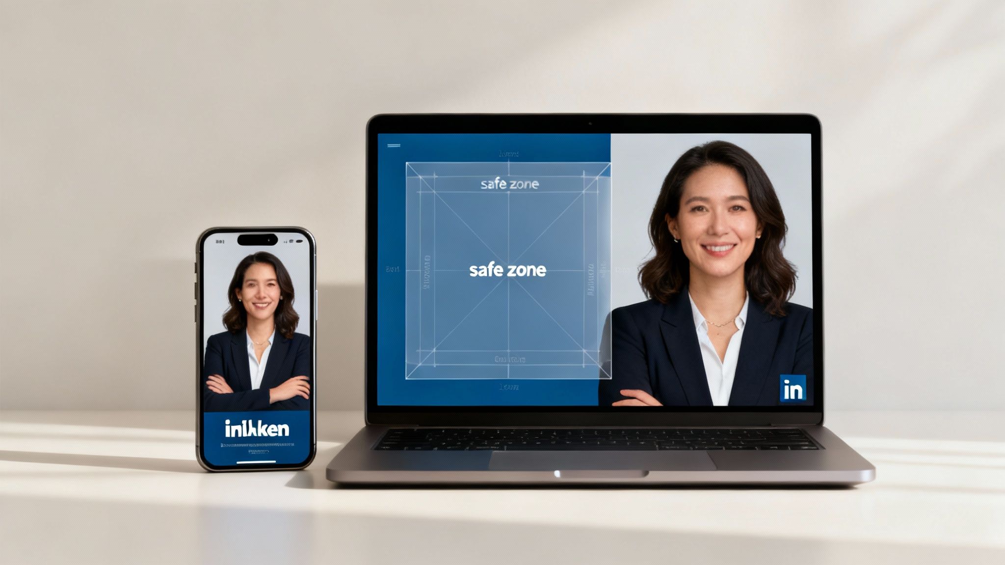
Using Safe Zones for Critical Information
To sidestep these frustrating cropping issues, you need to design with a "safe zone." Just imagine a border inside your image where you place everything that absolutely must be seen—text, logos, faces, you name it. By keeping the important stuff centered, you ensure it stays visible even when LinkedIn starts trimming the edges on different screens.
Here are a few practical tips to live by:
- Centralize Key Content: Keep your main message, logo, or call-to-action squished into the middle 50-60% of the image.
- Preview Before Posting: This one is a lifesaver. Before you hit publish, pull out your phone and see how the post actually looks in the mobile app. You'll catch so many potential mistakes this way.
- Simplify Your Message: Mobile screens are tiny. Don't cram your images with paragraphs of text or overly complex graphics that no one can read. Keep it simple and punchy.
Key Technical Specs and Best Practices
Getting your image dimensions right is a great start, but the real pro-level polish comes from nailing the technical details. I've seen countless great designs fall flat because of simple oversights like choosing the wrong file format or ignoring the size limits.
Think of these specs as your final quality check before hitting "post." They're what ensure your images don't just look good in your design software, but perform brilliantly on LinkedIn’s platform.
Choosing the Right File Format
You'll mostly be dealing with two formats: JPEG and PNG. They might seem interchangeable, but using the right one for the right job is critical for balancing quality and performance.
- Use JPEG for Photographs: JPEGs are your go-to for any image with complex colors and gradients, like photos of your team or product shots. The compression is fantastic for keeping file sizes down without making the image look grainy or pixelated.
- Use PNG for Graphics and Text: If your image has sharp lines, a logo, text overlays, or needs a transparent background, you have to use PNG. It keeps those edges crisp and clean, avoiding the fuzzy "artifacts" that JPEGs often create around text.
File Size Limits and Image Compression
LinkedIn is pretty strict with file sizes to keep the feed loading quickly for everyone. For most images, you're looking at a 5 MB maximum. Try to upload anything larger, and you'll just get an error message.
This means you’ve got to get into the habit of optimizing your images before you upload them. The goal is simple: get the file size as low as possible without wrecking the visual quality. Most decent design tools have built-in export settings to help with this. If you want to see how a popular platform handles this, check out our in-depth review of Canva, where we cover these features.
Remember, a smaller file size means a faster loading time for your audience. That’s a huge deal for anyone scrolling on a spotty mobile connection. A fast-loading image creates a better experience and can genuinely boost your engagement.
And this isn't just about static images. If you're using video, you've got to be just as mindful. There’s a great guide on how to compress MP4 videos specifically for LinkedIn that shows you how to meet their requirements without turning your video into a blurry mess. Mastering both is what separates the amateurs from the pros.
Got Questions About LinkedIn Image Sizes? Let's Troubleshoot.
Getting all the specs right for your LinkedIn images can feel like a moving target. Even when you follow the rules, you might still get hit with blurry pictures or wonky link previews. I've been there, and it's frustrating.
Think of this section as your quick-and-dirty troubleshooting guide. We'll tackle the most common headaches I see people run into so you can get back to creating great content.
Why Does My Image Look Blurry on LinkedIn?
This is probably the most common question I get. Blurry or pixelated images almost always come down to two culprits: you uploaded a low-resolution file, or LinkedIn's own compression mangled it.
LinkedIn runs every single image through its compression algorithm. If the file you upload is already small or low-quality, it's only going to look worse on the other side. To beat this, always start with a sharp, high-resolution source file. Exporting at the recommended size, like a crisp 1200 x 1200 pixels for a square post, gives LinkedIn less room to mess it up. Also, for graphics with text, a PNG file often keeps things looking much sharper than a JPEG will.
What Is the Best All-Purpose Image Size?
If you need one go-to, can't-mess-it-up image size for your day-to-day feed posts, make it a 1200 x 1200 pixel (1:1 ratio) square. It's your most reliable bet.
This format looks great in the feed on both desktop and mobile, so you don't have to worry about weird cropping chopping off half your message. While it’s not the right spec for things like your cover photo or link previews, its solid performance for single image posts makes it the undisputed champ for general content. It just works.
How Do I Fix an Incorrect Link Preview?
You share a link to your latest blog post, and LinkedIn pulls up an ancient, totally wrong preview image. Infuriating, right? This is almost always a caching problem on their end. LinkedIn saved an old version of your webpage's data and needs a little nudge to go look again.
The fix is surprisingly simple: use LinkedIn’s official Post Inspector tool. Just copy your URL, paste it into the Inspector, and hit the "Inspect" button. This forces LinkedIn’s servers to clear their cache and grab the fresh Open Graph (OG) image tag from your site. Try sharing the link again, and you should see the correct, updated preview.
Turn your professional expertise into consistent, high-impact content with PostFlow. Let your personal AI content strategist, Emilia, help you generate ideas, craft posts, and schedule them effortlessly. Start growing your LinkedIn presence today.