Formatting your LinkedIn posts isn't just about making them look pretty. It's a strategic play to stop the scroll and get people to actually read what you've written in a feed that moves at lightning speed. Let's be honest, a well-spaced post with a few visual hooks is always going to get more love than a giant wall of text.
Why Formatting Your LinkedIn Posts Is a Game-Changer
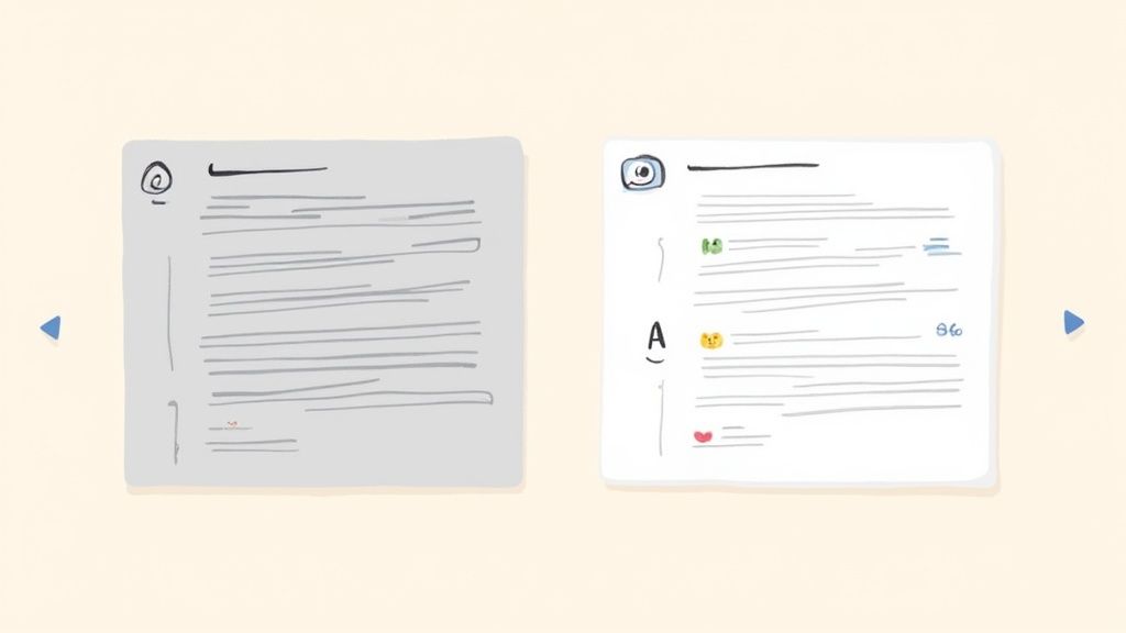
Think about the last time you were scrolling through LinkedIn. Did you ever just fly right past a huge, dense paragraph without even thinking about it? Of course you have. We all do. The content might have been brilliant, but it looked like a chore to read. That's exactly where good formatting comes in.
In a professional feed overflowing with updates, articles, and hot takes, attention is everything. Your job is to make your content as inviting and easy to digest as possible. Think of formatting as the friendly handshake that welcomes your reader in before they even read a single word.
The Psychology of a Good Scan
Our brains are wired to find the path of least resistance. We're naturally drawn to information that’s easy to process, which is why visuals get our attention so much faster than plain text. When someone sees a post broken up with white space, maybe a few bullet points, and some bold text, their brain immediately tags it as "easy to scan."
A wall of text does the opposite. It screams "cognitive load." It looks dense and time-consuming, triggering that "I'll save this for later" thought—which almost always means "never." This is even more true on mobile, where most people are scrolling through LinkedIn. What looks intimidating on a desktop becomes an endless, unreadable scroll on a phone.
Formatting isn't decoration; it's about clear communication. By making your post scannable, you're respecting your audience's time and making sure your key points actually get seen.
And this isn't just a hunch; the data backs it up. Studies have shown that posts using simple formatting like bullet points and line breaks can get up to 300% more engagement than plain text. That’s a massive difference, and it happens because formatted content is just easier for our brains to process in a busy feed. Considering we process visuals up to 60,000 times faster than text, a scannable post has a serious head start. You can dive deeper into these engagement stats and how they can impact your content strategy.
More Than Just Looking Good
Getting your formatting for LinkedIn posts right goes way beyond aesthetics. It’s a powerful tool that directly impacts your professional brand and how well your content performs.
Here’s a breakdown of what you're really achieving:
Better Visibility and Engagement: Posts that are easy to read get more likes, comments, and shares. Those early signals tell the LinkedIn algorithm your content is valuable, so it shows it to more people. Simple as that.
It Shows You're a Pro: A thoughtfully formatted post sends a subtle message: you care about the reader's experience. It shows attention to detail and a commitment to clear communication—qualities that clients, employers, and partners are always looking for.
Your Message Lands Harder: By using line breaks, lists, and a bit of bolding, you guide the reader's eye right where you want it to go. You’re in control of the narrative, making sure your main takeaways are impossible to miss.
You Stand Out: At the end of the day, the feed is a competition for attention. A post that is visually distinct and easy on the eyes has a built-in advantage. It stops the scroll and invites people into the conversation.
Nailing Your Hook and Opening Lines
The first two lines of your LinkedIn post are everything. Seriously. They're the most valuable real estate you've got on the platform. Before anyone gets to your brilliant insights or your killer call-to-action, they see that tiny preview. It’s what makes them either stop scrolling or just fly right past.
Think of it like a killer headline or an email subject line you can't help but open. If it doesn't immediately spark curiosity or signal that something valuable is coming, the rest of your post might as well be invisible. You get one shot to convince a busy person your post is worth their time.
Why Those First Few Words Are So Crucial
You’ve seen it a thousand times: LinkedIn cuts off every post after a few lines, hiding the good stuff behind that little "...see more" link. Your number one job is to make people need to click it. A bland, generic opening is a one-way ticket to getting ignored.
The algorithm is watching, too. Posts that get quick engagement are flagged as high-quality content and get pushed out to a much wider audience. This is more important than ever, especially since recent data shows organic views have dropped by 50% and engagement by 25%. The platform is clearly rewarding quality, and a strong hook is your first signal to the algorithm that your post is worth showing around. You can dig into the specifics in this breakdown of the LinkedIn algorithm.
Hook Formulas That Actually Work
A great hook isn't about writing clickbait; it's about creating genuine intrigue. Here are a few tried-and-true approaches I use to stop the scroll and earn that click.
Ask a Question That Hits Home: Frame a problem you know your audience is dealing with.
- Instead of: "Today I'm discussing effective leadership."
- Try: "What's the one leadership mistake that quietly destroys team morale?"
Drop a Contrarian Take: Go against the grain and challenge a popular belief in your field.
- Instead of: "Networking is important for your career."
- Try: "Hot take: Your network is useless if you're making this one common mistake."
Lead with a Shocking Stat: A surprising number is a fantastic pattern-interrupt.
- Instead of: "Our recent project had great results."
- Try: "We just increased client retention by 47% in 90 days. Here’s the one-slide framework we used."
Start in the Middle of a Story: Jump right into a personal anecdote that people can relate to.
- Instead of: "I learned a lot from a recent mistake."
- Try: "I completely bombed the most important presentation of my career. Here are the three lessons I learned from the wreckage."
The best hooks create what’s called a "knowledge gap." They make the reader feel like they're missing a critical piece of the puzzle—a piece you’re about to give them as soon as they click "...see more."
When you get these opening lines right, your post stops being just another piece of content. It becomes an invitation—a conversation that your audience feels an urge to join.
Mastering Readability with Spacing, Emojis, and Symbols
So you've nailed the hook. Now what? The body of your post is where you deliver the goods, but even the most brilliant insights get lost in a massive wall of text. The secret to keeping people reading is all about making your post easy on the eyes. This means getting smart with spacing, emojis, and a few other visual tricks.
Good formatting for LinkedIn posts isn't just about making things look pretty—it's about clear communication. You're guiding your reader's eye, making your message scannable, and respecting their time. This is especially true on mobile, where over 70% of LinkedIn activity now happens.
Embrace the Power of White Space
Your most powerful formatting tool? The "Enter" key. Seriously.
White space isn't just empty space; it's a visual cue that gives your content room to breathe. It makes your post feel less intimidating and way easier to digest. Long, clunky paragraphs are the number one enemy of engagement on LinkedIn.
Try breaking your thoughts into short paragraphs, just one to three sentences each. This creates a natural, easy-to-follow rhythm. Instead of hitting them with a solid block of text, you’re serving up a series of bite-sized, digestible ideas that invite them to keep scrolling.
This infographic gives you a great starting point for thinking about how to grab attention right from the first line, which perfectly sets the stage for the well-spaced content that should follow.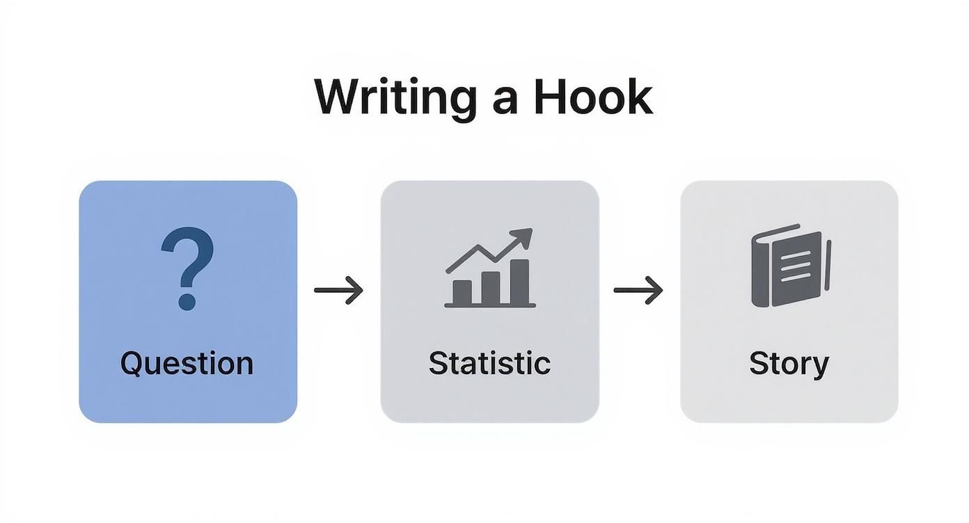
As you can see, different types of hooks—like a provocative question, a surprising statistic, or a personal story—can pull the reader in, making them ready for the value you've structured so clearly.
Create Structure with Lists and Bullets
Once you've got some breathing room with line breaks, it's time to organize your key points. Bulleted and numbered lists are your best friends here. They immediately signal to the reader that they're about to get clean, skimmable information.
And you don't have to stick with the plain old black dot. LinkedIn lets you get creative with other characters that work just as well.
- Asterisks: A simple, clean classic for any list.
- Dashes: Another great choice for a neat, minimalist look.
→ Unicode Arrows: These are fantastic for guiding the eye, especially in step-by-step instructions.
✅ Checkmarks: Perfect for highlighting benefits, takeaways, or completed tasks.
Numbered lists come in handy when the sequence matters, like when you're walking someone through a process or ranking items. They provide a logical flow that's incredibly easy to follow from start to finish.
Use Emojis and Symbols with Purpose
Emojis are more than just a bit of fun; they're visual tools. When you use them strategically, they can draw attention to key points, inject some personality, and even boost comprehension without adding clutter.
The trick is strategic placement. Don't just sprinkle them in randomly. Use them to serve a purpose. A lightbulb emoji (💡) is a great way to introduce a new tip, while a rocket (🚀) can signal growth or a new launch.
As a rule of thumb, I stick to no more than 3-5 emojis in a single post. This keeps things looking professional and ensures the emojis support your message instead of distracting from it.
Think of them as little signposts. An emoji at the start of a line can even act as a custom bullet point, helping to categorize your points at a glance.
A Curated Library of Useful Unicode Symbols
While LinkedIn has its own emoji picker, I keep a personal list of clean, professional Unicode symbols handy to give my posts a more polished look. These render consistently across devices and add a touch of class.
Here are a few of my go-to symbols, grouped by use:
- Arrows: → ➔ ⇒ ➤
- Checks & Crosses: ✓ ✔ ✅ ☑ ❌ ✘
- Geometric Shapes: ● ■ ◆ ◈ ✦
- Highlight Markers: ★ ☆ ✪ ➤
Using them is as simple as copying and pasting them right into your post. I often use them to create custom lists, break up different sections of a post, or point directly to a call-to-action. For example, a simple arrow (→) just before a link makes it crystal clear where you want people to click.
To help you get started, here's a quick reference table I put together.
Table: Formatting Elements and Their Strategic Use
This table breaks down some of the most common formatting elements, what they're good for, and how to use them effectively on LinkedIn.
| Formatting Element | Purpose | Best Practice Example |
|---|---|---|
| Line Breaks | Improve readability and scannability by creating white space. | "Don't write a wall of text. Instead, break up your ideas. It's much easier to read." |
| Bulleted Lists | Organize non-sequential information and make key points stand out. | "My top 3 tools are: • Tool A • Tool B • Tool C" |
| Numbered Lists | Guide the reader through a process or a sequence of steps. | "Follow these 3 steps: 1. Do this first. 2. Then do this. 3. Finally, do this." |
| Emojis | Add personality, draw attention, and act as visual cues. | "💡 Pro-Tip: Always add a CTA. 🚀 We just launched our new feature!" |
| Unicode Symbols | Create custom bullets, dividers, or highlight key information. | "→ Learn more at my website. ★ Key Takeaway ★" |
| Bold Text | Emphasize headings, statistics, or the most critical takeaway. | "We saw a 200% increase in engagement." |
| Italic Text | Add subtle emphasis to a word, share a quote, or pose a question. | "What would you do in this situation?" |
Keep this handy as a quick cheat sheet next time you're drafting a post.
Adding Emphasis with Bold and Italics
You might have noticed that LinkedIn's editor doesn't have buttons for bold or italics. No problem. You can easily generate this formatting using third-party Unicode text converters. A great one is offered by the team at PostFlow. Just type your text into their tool, choose the format you want, and copy it straight into your LinkedIn post.
This is a game-changer for creating a clear visual hierarchy in your content.
- Bold text is perfect for grabbing attention. Use it for your main point, a startling statistic, or section headings within a longer post.
- Italic text is more subtle. It’s great for emphasizing a specific word, sharing a quote from someone, or posing a thoughtful question.
But a word of caution: use them sparingly. If you emphasize everything, you emphasize nothing. Save bold and italics for the moments that truly matter, and they'll have the impact you're looking for. By weaving together these elements—plenty of white space, structured lists, purposeful symbols, and a touch of emphasis—you can turn any post into a clear, engaging, and incredibly readable piece of content.
Weaving in Visuals to Stop the Scroll
Let's be honest, text alone is just one part of the equation. If you want to create a LinkedIn post that really performs, you need to blend your carefully chosen words with eye-catching visuals. Media isn’t just window dressing; it’s what stops the endless scroll, brings your message to life, and can seriously ramp up your engagement.
But it’s not as simple as just slapping a picture onto your post and calling it a day. The type of media you choose and how it complements your text can make or break your post's success. The goal is to create a seamless package where your words and visuals tell one cohesive, powerful story.
Choosing the Right Tool for the Job
Different messages demand different visual formats. Before you even open up Canva, ask yourself: what am I trying to do here? Am I teaching a complex process, sharing a personal story, or breaking down some data?
Here’s a quick rundown of how I think about matching my goal to the right media type:
- Single Image: This is your go-to for a quick, powerful punch. It’s perfect for a strong headshot, a visualized statistic that makes people go "wow," or a candid behind-the-scenes moment. It’s direct, simple, and incredibly effective.
- Video: Nothing beats video for storytelling, walking someone through a tutorial, or just letting your personality shine. Keep them short and sweet—videos under 90 seconds are gold for grabbing and holding attention on the feed.
- Document (Carousel): This is your secret weapon for breaking down complex ideas, sharing step-by-step guides, or repurposing a slide deck. Carousels get people to slow down and spend more time on your post, which is a signal the LinkedIn algorithm loves.
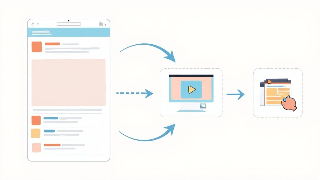
Think of your visual as the main event. Your text is the opening act—it provides the context, hooks the reader, and gets them excited to dive into the media you’ve shared.
The Art of a Great Carousel Post
Carousels, which you upload as a PDF, used to be the undisputed king of LinkedIn reach. And while the landscape has shifted a bit, a well-executed carousel can still blow most other post types out of the water.
The problem is, many people create carousels that are just... boring. They’re too long, the text is tiny, or they ramble on without a clear point. This doesn't just fail to get engagement; it actively annoys your audience. In fact, recent data shows the average reach of carousels has dipped by 18%, with engagement falling by 25% as users get pickier. The bar is higher now. For a closer look at this trend, you can explore the data on LinkedIn content performance.
To make a carousel work in today's feed, it has to be a complete story in a bite-sized package. The first slide is your hook, the middle slides deliver the goods, and the last slide tells them what to do next. It's a mini-presentation built for a thumb-swipe.
So, what does a winning carousel look like? It always has these elements:
- A Scroll-Stopping Cover: This is non-negotiable. It needs a bold headline, an intriguing question, or a striking image. The cover has one job: make someone stop and swipe.
- A Cohesive Story: Each slide needs to flow naturally to the next. Stick to consistent branding, fonts, and colors to make it look professional and feel easy to follow.
- Bite-Sized Chunks: Nobody wants to read a novel on a carousel slide. Use bullet points, big fonts, and lots of empty space. Each slide should communicate just one simple idea.
- A Clear Call-to-Action: Don't just end it. The final slide is your chance to get a response. Ask a question, tell them to comment with their thoughts, or point them to a link.
Tech Specs and Quick Tips
To make sure your media looks sharp and professional, you need to play by LinkedIn’s rules. A poorly sized image or a pixelated video can instantly kill your credibility.
Optimal Dimensions and Best Practices:
| Media Type | Recommended Dimensions | Best Practices |
|---|---|---|
| Single Image | 1080x1350px (Portrait) | Portrait orientation takes up more vertical space on mobile phones, making your post much harder to ignore. |
| Video | 1920x1080px (Landscape) or 1080x1920px (Portrait) | Aim for under 90 seconds. Always add captions—over 80% of social videos are watched on silent. |
| Carousel (PDF) | 1080x1350px (Portrait) | Design it for swiping. Use visual cues like arrows or "swipe for more" text. I'd recommend keeping it under 10 slides. |
One final, crucial tip: always attach your media first. When you're composing your post, upload the image, video, or PDF before you write your text. This ensures the visual appears front and center in the feed, grabbing attention before anyone even reads your first sentence.
Closing Strong with Effective CTAs and Hashtags
https://www.youtube.com/embed/i2t4dH5CJVU
Your first line gets people to stop scrolling, but your last line is what gets them to act. A strong finish is the real difference-maker—it’s what turns a passive “like” into a real conversation or a tangible business result. This is where your call-to-action (CTA) and hashtags come in, turning a simple post into a strategic move.
Think about it: a post without a clear next step is just a dead end. You’ve put in the work to craft a killer hook and share something valuable, so don't leave your audience hanging. You need to tell them what to do next.
Crafting the Perfect Call-to-Action
Your CTA is your direct instruction to the reader. It should feel like a natural next step, not a clunky sales pitch dropped in at the end. The trick is to match the intensity of your ask to the value you just delivered. If you share a quick tip, a simple question is perfect. If you’ve just laid out a detailed solution to a major problem, you’ve earned the right to ask for something bigger.
I like to think of CTAs on a spectrum, from soft to direct.
Soft CTAs (Engagement Prompts): These are low-effort questions designed to kick off a conversation in the comments. They’re fantastic for building community and showing the LinkedIn algorithm your content is sparking discussion.
- Example: "What's one marketing tool you absolutely can't live without? Drop it in the comments."
- Example: "Ever faced a similar challenge on a project? I'd love to hear how you handled it."
Direct CTAs (Action Prompts): These guide your reader to do something specific off the post, like visiting a link, downloading a file, or booking a call. Save these for when you’ve provided serious value and built up some trust.
- Example: "If you want the full framework, you can download my free guide here → [Link]"
- Example: "Ready to build a content system that actually works? Let's chat. You can book a call with my team here."
A great CTA makes the reader feel smart and empowered, not sold to. It should be a logical next step that offers them even more value, whether that's joining a conversation or accessing an exclusive resource.
One of the most common mistakes I see is a vague CTA. "What do you think?" is fine, but it’s lazy. "What's the #1 reason you think projects fail?" is so much better. It's specific, gives people a clear starting point, and tends to generate much more thoughtful comments.
Using Hashtags as a Discovery Tool
Hashtags aren't just a finishing touch; they're a core part of your post's discovery strategy. They act like signposts, categorizing your content and helping it find the right audience beyond your immediate network. When you use them well, hashtags plug your post into relevant conversations and put it in front of people actively searching for your kind of expertise.
But please, don't just stuff a dozen random hashtags at the bottom. That looks spammy and confuses the algorithm. These days, less is more. The sweet spot is 3 to 5 highly relevant hashtags. This focused approach tells LinkedIn exactly what your post is about, which dramatically increases the chances of it being shown to the right people.
Finding the Right Mix of Hashtags
A truly effective hashtag strategy isn't just about picking a few keywords. It's about blending different types of tags to get the best of both worlds: broad reach and niche relevance.
Here’s the blend I always recommend:
- Broad Hashtags: These are the big, popular tags in your field (like
#marketing,#leadership, or#sales). They get your content in front of a massive audience. - Niche Hashtags: These are much more specific and target a focused community (think
#b2bcontentstrategy,#saasmarketing, or#executivecoaching). The audience is smaller, but they're the people you really want to reach. - Branded Hashtags: This is your own unique tag (for example,
#PostFlowTipsor#GetAuthoredUp). It’s a great way to group all your content together and encourage your community to share their own posts related to your brand.
For instance, a marketing consultant could use a powerful trio: #marketing (broad), #leadgenerationstrategy (niche), and #ConsultingWithClara (branded). This combo covers all the bases, from general discovery to sharp, targeted positioning.
By pairing a compelling CTA with a smart mix of 3-5 hashtags, you give your post the powerful closing it deserves. This final step is what ensures your content doesn't just get seen—it drives the action that builds your influence on LinkedIn.
Got Questions? I’ve Got Answers.
Even when you feel like you've got your LinkedIn formatting down, a few nagging questions always seem to pop up. Let's clear the air on some of the most common ones I hear so you can hit that "Post" button without any second-guessing.
Can I Fix a Post After I've Published It?
Yes, you can! And it’s a lifesaver. Just find your post, click the three little dots in the top-right corner, and hit "Edit post."
But—and this is a big but—there are a couple of catches you need to know about:
- Your visuals are set in stone. Once your post is live, you can't swap out an image, add a video, or change a PDF carousel. If you spot a mistake in your media, your only option is to delete the whole thing and start from scratch. Ouch.
- Editing might ding your reach. The LinkedIn grapevine has long whispered that making big edits can throttle a post's momentum in the algorithm. While it's not a hard-and-fast rule, it’s always best to give your post a final, eagle-eyed proofread before you publish. Save the edit button for catching small typos.
What’s the Sweet Spot for Post Length?
There's no magic number here, because the "right" length really depends on what you're trying to say. That said, the data consistently shows that posts in the 150 to 300-word range often hit a sweet spot. They’re meaty enough to provide genuine insight but still quick and easy to read on a phone.
What truly matters isn't the word count—it's the value you pack into those words. A knockout 50-word insight will always beat a rambling 500-word post that goes nowhere. Make every single word earn its place.
How Many Hashtags Are Too Many?
Gone are the days of stuffing your posts with a dozen hashtags and hoping for the best. Today, less is definitely more.
The gold standard is 3 to 5 hyper-relevant hashtags. This gives the LinkedIn algorithm crystal-clear signals about your content's topic, helping it land in front of the people who actually want to see it. Try using a mix of one or two broad tags, a couple of niche ones, and maybe a branded one for good measure.
Does My Formatting Actually Help with LinkedIn SEO?
It absolutely does, though not always in the way you might think. Good formatting is a quiet but powerful player in getting your content discovered on and off LinkedIn.
Here’s how it works:
- Emphasizing Keywords: When you bold a key phrase (using a third-party tool), you’re essentially telling the algorithm, "Hey, this part is important!" This can give that term a little extra weight in search results.
- Boosting Engagement: A post that's easy on the eyes gets more engagement—more likes, comments, and shares. And engagement is one of the biggest signals LinkedIn uses to decide whether to show your post to more people. A readable post is a discoverable post.
- Connecting Through Hashtags: Think of hashtags as built-in keywords. They are the most direct way to connect your content with professionals actively searching for those exact topics.
When you take the time to format your posts thoughtfully, you’re not just making them look better. You’re making them work harder for you.
Ready to stop guessing and start posting with confidence? PostFlow is your AI content strategist that turns your raw ideas into consistently great LinkedIn content. Emilia, our AI, interviews you to pull out your best stories and insights, then helps you write, format, and schedule posts that reflect your unique voice.
Start growing your LinkedIn presence with PostFlow today.
Article created using Outrank