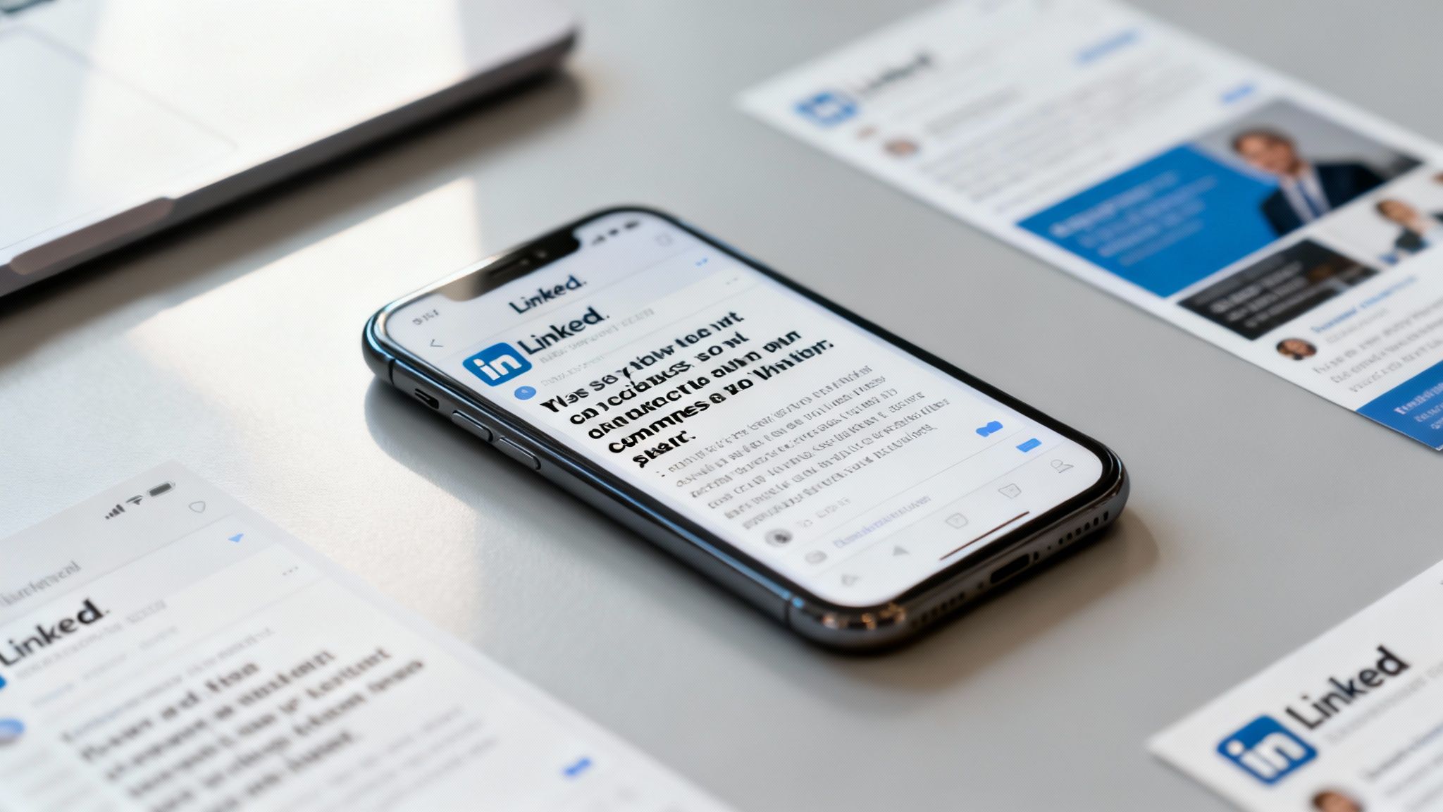
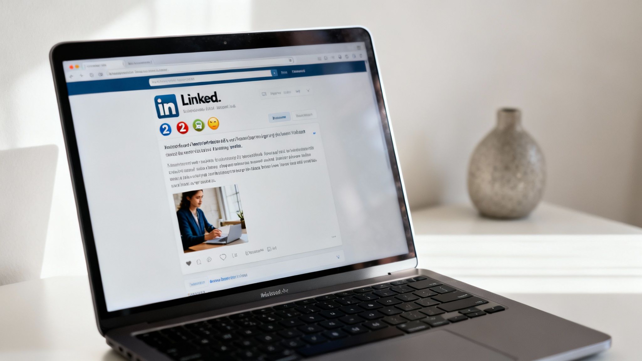
Ever scrolled past a LinkedIn post without reading it, even though the topic looked interesting?
Chances are, it wasn’t the idea that failed—it was the presentation. The secret to getting your posts read, and not just seen, often comes down to formatting. It’s not about making things look pretty; it's a strategic move to grab and hold attention on a platform where every second counts.
Why Post Formatting Is Your Secret Weapon on LinkedIn
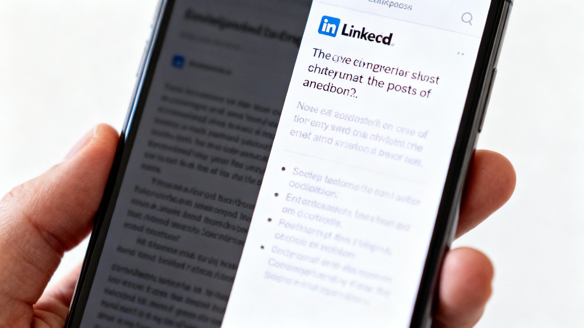
Think about your own behavior on LinkedIn. You’re scrolling quickly, likely on your phone, and your brain is making split-second decisions about what’s worth your time. A dense, unbroken block of text is a stop sign. It looks like hard work.
In contrast, a post with short paragraphs, plenty of white space, and a few visual cues feels inviting. It’s easy on the eyes and promises a quick, digestible piece of information. That’s the difference between a post that gets scrolled past and one that gets read, liked, and shared.
The Psychology of Scannable Content
Our brains are wired for efficiency. When we see a wall of text, our instinct is to skip it to conserve mental energy. This isn't laziness; it's a survival mechanism in an age of constant information overload. Good formatting works with this natural behavior, not against it.
Here’s how you make your content scannable:
- Short Paragraphs: Stick to one or two sentences. This breaks down complex ideas into bite-sized, manageable chunks.
- Visual Cues: Emojis and bullet points act like signposts, drawing the eye down the page and highlighting the most important takeaways.
- White Space: Don't be afraid of hitting "enter." Line breaks create a visual rhythm that makes your content feel less intimidating and more approachable.
This isn't just theory. The data backs it up, especially when you consider how many people are using LinkedIn on the go.
Given that a huge chunk of LinkedIn activity happens on a small screen, optimizing for mobile isn't just a nice-to-have. It’s absolutely critical.
From Ignored to Engaging
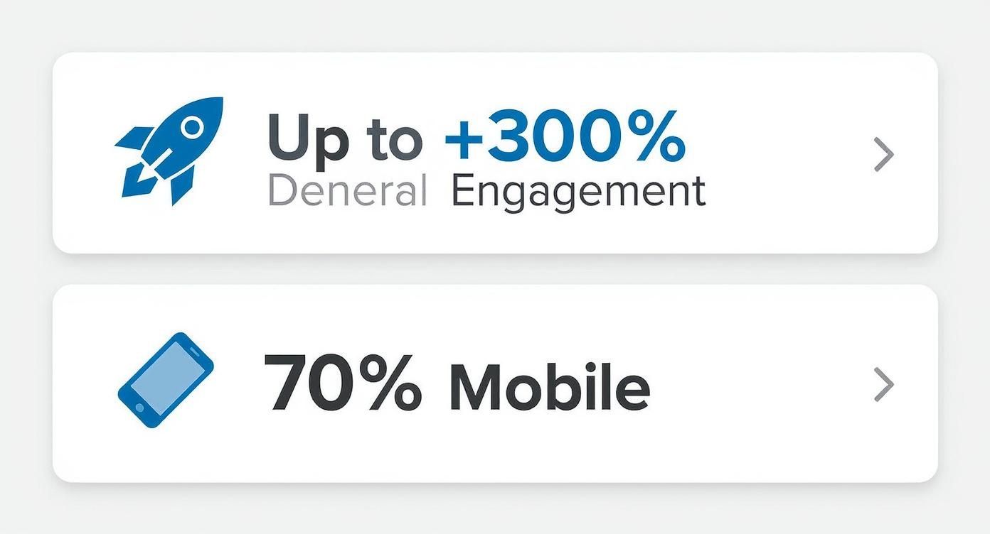
The difference formatting makes is genuinely staggering. A well-structured post can pull in up to 300% more engagement than an identical one presented as a block of text. When you remember that 70% of LinkedIn usage is on mobile devices, it's easy to see why scannability is king.
To give you a clearer picture, let's break down how formatting directly influences the metrics that matter.
Impact of Formatting on Post Performance
| Metric | Unformatted Post (Wall of Text) | Formatted Post (Scannable & Visual) |
|---|---|---|
| Initial Impression | Overwhelming, looks time-consuming. | Inviting, easy to digest at a glance. |
| Read Time | Low. Most users scroll past. | High. Users are encouraged to read through. |
| Key Message Recall | Poor. Main points are buried. | Excellent. Key takeaways are highlighted. |
| Likes & Reactions | Minimal. Low readership leads to low engagement. | Significantly higher due to better readability. |
| Comments | Few. No clear prompts or discussion starters. | Increased, as clear CTAs are more visible. |
| Shares | Rare. Content isn't easy to consume or share. | More likely, as the content is valuable and easy to pass on. |
As you can see, the choice is pretty clear. A few simple formatting tweaks can be the difference between a post that sinks without a trace and one that sparks conversation and builds your authority.
Formatting is the bridge between your great idea and your audience's attention. Without it, even the most brilliant insights can get lost in the noise. A well-thought-out approach to how you present your content is just as vital as the message itself, laying the groundwork for effective social media content planning. By mastering how to format LinkedIn posts, you build credibility, boost visibility, and ensure your expertise gets the recognition it deserves.
Crafting a Hook That Demands a Click
Your first few lines are everything. Seriously. In a feed where everyone is scrolling a mile a minute, you have about two seconds to stop the thumb. That initial snippet of text, the part visible before LinkedIn hides the rest behind "...see more," is your entire pitch. It's the difference between engagement and getting scrolled past into oblivion.
A killer hook doesn’t just state your topic; it sparks immediate curiosity. It makes a promise, challenges a common belief, or hits on a relatable problem that makes your reader nod and think, "Yeah, I've been there."
Think of it like the headline on a magazine cover. Its only job is to make you need to know what's inside. A flat, generic opener like, "I wanted to share some thoughts on leadership," is dead on arrival. It’s professional white noise.
This is even more critical on mobile, where the screen is smaller and attention spans are even shorter. To make an impact, your hook has to land its punch within the first 2-3 lines.
Types of High-Performing Hooks
To get noticed on LinkedIn, you need a few different types of hooks in your toolkit. Let's skip the generic advice and get into specific, battle-tested approaches that I've seen work time and time again.
Here are a few of my go-to techniques:
- The Bold Claim: Kick things off with a strong, maybe even slightly controversial, opinion. Something that makes people pause. For example, "Your to-do list is actually ruining your productivity."
- The Relatable Struggle: Start with a pain point that your target audience feels deep in their bones. Something like, "I sent 50 cold emails last week. Exactly one person replied."
- The Surprising Statistic: Drop a compelling number that creates instant intrigue. For instance, "90% of startups fail, but not for the reason you think."
The goal is to connect instantly, whether it's on an emotional or intellectual level. A bland intro gives them zero reason to click. If you're looking for more inspiration, you can find some fantastic examples of great hooks to adapt for your own posts.
From Bland to Unforgettable
Let’s look at a real-world transformation. A tiny shift in the opening can make all the difference.
Before:
"Today, I want to talk about the importance of networking. It’s a key skill for professional growth and can open up many opportunities if you approach it correctly. Here are my tips for better networking."
After:
"I used to hate networking.
The awkward small talk, the forced handshakes... it all felt completely fake.
Then one simple mindset shift changed everything. Here's what I learned."
See the difference? The "After" version is personal, raw, and kicks off a story people want to see the end of. It doesn't just announce a topic; it pulls the reader into an experience. That's the secret to a hook that truly earns that click.
Mastering White Space for Effortless Readability
You’ve nailed the hook. Awesome. But now comes the part where most professionals drop the ball: the body of the post. It’s so tempting to dump all your brilliant insights into a few dense paragraphs, but on LinkedIn, a wall of text is a scroll-stopper. It’s the fastest way to lose your reader, no matter how good your content is.
The fix is deceptively simple: get comfortable with white space.
Think of line breaks as a formatting superpower. When you break your post into short, single-sentence lines, you create a natural reading rhythm. It pulls the reader’s eye down the page, making your content feel light, breezy, and easy to digest. This isn't just about looking good; it's a strategic move that taps directly into how people consume content on the platform.
Why Shorter Is Better
The way you structure your LinkedIn posts directly impacts how well they perform. It's not just a hunch—the data backs it up. Posts packed with short sentences (we’re talking under 12 words) see a 20% bump in performance compared to posts with longer, more complex sentences.
Why? Because they're a breeze to process, especially on the small screens where most of us are scrolling. For more on how post structure affects engagement, check out these LinkedIn statistics from Buffer.
This "less is more" idea also applies to your overall post length. While there's a character limit for LinkedIn posts, the sweet spot is all about delivering value without making your reader feel overwhelmed.
White space isn't about what you leave out; it's about making what you leave in more powerful. Each line break is a little pause, an invitation for your reader to absorb the last point before moving on to the next one without any friction.
To make this a habit, try giving every distinct thought its own line. It forces you to be concise and makes sure your key messages land with absolute clarity.
Structuring the Body for Maximum Impact
Beyond just hitting "enter" a few times, you can use other formatting tricks to keep readers locked in. Instead of a bland paragraph, give your ideas some visual structure.
- Use Bullet Points: When you're listing key takeaways, features, or steps, bullet points (like ● or ✔) are your best friend. They signal to the reader, "Hey, this is important, scannable info!"
- Try Numbered Lists: If you're walking someone through a process or a sequence, a numbered list creates a logical flow that’s dead simple to follow.
- Incorporate Emojis as Anchors: A well-placed emoji can act as a visual signpost. A 💡 for a new idea or a 🚀 for a big result instantly draws the eye to a key point.
A word of caution, though: it's all about balance. Go overboard with line breaks, and your post can feel spammy or frustratingly long. The goal here is readability, not to artificially puff up your post's length.
Keep your core message tight and use white space to make it shine. Once you embrace this approach, you'll start turning those intimidating blocks of text into scannable, digestible, and seriously engaging content.
Using Emojis and Visuals with Purpose
Emojis and visuals walk a fine line on LinkedIn. Get it right, and you add personality and guide your reader’s eye. Get it wrong, and you look unprofessional and cluttered. The key is to be intentional.
Think of emojis as punctuation with a bit of flair. A well-placed emoji can break up a wall of text, highlight a key point, or inject some warmth. But the goal here is clarity, not decoration. A post littered with a dozen random emojis just looks spammy and can be a nightmare for anyone using a screen reader.
Choosing the Right Visuals for Your Post
Beyond emojis, the media you attach is a massive part of how you format LinkedIn posts for real engagement. Each format has a different job to do.
Here’s a quick rundown to help you decide what to use:
- Single Image: This is your scroll-stopper. Use a high-quality, relevant photo or a crisp branded graphic to make your post pop. It's perfect for telling a quick story or landing a single, powerful idea.
- Video: Absolutely unbeatable for storytelling and showing your personality. Short, captioned videos work wonders for tutorials, sharing a quick thought, or giving a behind-the-scenes peek. People tend to stick around longer for video.
- Document/Carousel (PDF): Your best bet for sharing deep-dive information. Carousels are fantastic for breaking down complex topics, showcasing data, or repurposing that slide deck you spent hours on. They drive active engagement because users have to physically click through.
The visual you pick should always back up your text, not just be a random add-on. I've seen it a hundred times: a stunning image paired with a weak message falls flat, and a brilliant post can be totally torpedoed by a low-quality, pixelated visual. Consistency here is how you build a recognizable brand.
Your visuals are the first thing people see. They determine whether someone stops scrolling or keeps moving. Always ensure your images and videos are high-resolution and properly sized to avoid looking unprofessional.
Making sure your visuals are perfectly sized is non-negotiable for a polished look. We've put together some great advice on this in our detailed guide to the correct LinkedIn post image size.
And for a truly comprehensive resource, check out this Ultimate Post Image Guide for LinkedIn. It provides the exact dimensions you need to make your content look sharp on any device.
Closing Your Post with a Powerful CTA
How you end your post is just as critical as how you start it. You’ve managed to hook your reader and deliver some real value, but those last few lines are what will determine what they do next. This is your chance to guide them from just scrolling past to actually engaging with your content through a solid call-to-action (CTA), thoughtful mentions, and the right hashtags.
Let’s be honest, a lazy ending like "Thoughts?" almost always falls flat. It’s too broad, too generic. Your real goal is to ask for a specific, meaningful response that gets a genuine conversation going and signals to the LinkedIn algorithm that your post is worth showing to more people.
Crafting a Compelling Call to Action
Instead of lobbing a vague question out there, give your audience a clear and simple task. The best CTAs feel like a natural extension of the conversation and tie directly back to the content you just shared.
Think about swapping out the generic stuff for more effective prompts like these:
- Specific Questions: Ditch "What do you think?" for "What’s one book that completely changed your perspective on leadership?"
- Experience Prompts: Get people sharing their own stories with something like, "Share a time you faced a similar challenge in the comments."
- Opinion Polls: Frame a question with two clear choices: "Do you prefer remote work or a hybrid model? Let me know below."
These kinds of CTAs lower the barrier to entry. They make it incredibly easy for someone to jump into the conversation without having to overthink their response.
Using Hashtags and Mentions Strategically
Hashtags and mentions are your secret weapons when you format LinkedIn posts for better reach, but only if you use them with intention.
Hashtag Best Practices
Think of hashtags as digital filing folders for your content. They’re what make your post discoverable to people who don't follow you yet but are interested in your topic.
The sweet spot is between 3 and 5 relevant hashtags. Any more than that can look spammy and just dilute your core message. It’s all about relevance over quantity.
I recommend using a mix of tags:
- Broad: A popular, high-volume tag like
#Marketingor#Leadership. - Niche: A more focused tag like
#B2BContentStrategyor#StartupGrowth. - Branded: A unique tag for your business or personal brand, like
#PostFlowTips.
Mentioning with Purpose
Tagging another person or company page (@mention) is a fantastic way to give credit where it's due, pull someone into a relevant discussion, or highlight a collaboration. The key word here is relevant.
Randomly tagging influencers just to get on their radar is a bad look and can seriously damage your credibility. Only mention people when it genuinely adds value to the post and the conversation.
When you nail the ending, you’re combining a strong CTA with smart, relevant hashtags. This is how you transform a simple post into a powerful conversation starter that expands your reach and helps you build a real community.
Your Pre-Publish Formatting Checklist
Before you hit "Post," stop. Take 60 seconds to run through this final review. I can't tell you how many times I've seen a potentially great post fall flat because of a simple, avoidable mistake.
This quick scan is your last line of defense. Think of it as the final polish that turns a good draft into a piece of content that actually performs. Making this a non-negotiable part of your workflow is how you build the habit of publishing with intention.
The Final Polish
Run through these five points. They’ll save you a lot of grief later.
- Hook Check: Does that first line actually make you want to read more? Read it out loud. If it sounds flat or confusing, it is. Rework it until it has some punch.
- Mobile Preview: Seriously, how does it look on a phone? Are your paragraphs short and snappy (1-2 sentences is the sweet spot)? Is there enough white space to keep it from looking like a daunting wall of text?
- Clear CTA: Is your call-to-action specific and easy to answer? "Thoughts?" is lazy. Try asking a direct question that ties back to your post's main point. Give people a clear next step.
- Emoji & Formatting Scan: Did you use emojis and bold text strategically? They should guide the reader's eye to the most important parts, not just be there for decoration. Less is often more.
- Hashtag Count: Stick to 3-5 relevant hashtags. Anything more looks spammy and can actually dilute your post's reach by confusing the algorithm.
Treat this checklist like a pilot's pre-flight inspection. It transforms formatting from a guessing game into a repeatable strategy for success.
A quick table can make this even easier to ingrain into your process.
Pre-Publish Formatting Checklist
Here's a quick review to ensure your content is optimized for engagement and readability before it goes live.
| Check Point | Yes/No | Notes |
|---|---|---|
| Is the hook compelling? | Does it spark curiosity or state a bold claim? | |
| Is it mobile-friendly? | Short paragraphs, ample white space. | |
| Is the CTA specific? | Avoid generic questions. Ask something direct. | |
| Is formatting used with purpose? | Bold/emojis guide, don't distract. | |
| Are there 3-5 relevant hashtags? | Check for relevance and avoid spammy tags. | |
| Did you tag relevant people/pages? | Only tag if they are mentioned or directly involved. | |
| Did you add media (image/doc)? | Does it add value and context to the post? |
Running through these quick checks takes a minute, but it can make all the difference in how your content is received. It’s a small investment of time for a much bigger return on engagement.
Answering Your Top Post Formatting Questions
Even when you have a solid plan, a few specific questions always seem to pop up right when you’re about to hit "post." I get it. Let’s clear up a few of the most common formatting hurdles so you can publish your next piece with total confidence.
How Does the “See More” Cutoff Affect My Post?
That little "See more" link is probably the single most important formatting constraint on all of LinkedIn. On mobile, it usually kicks in after the first 2-3 lines of text. This makes your opening sentence or two the most valuable real estate you have.
Think of it this way: your hook has to do all the heavy lifting within that tiny preview window. You need a bold claim, a relatable pain point, or a stat that makes people stop and think. If you bury the good stuff below the fold, there’s a good chance it will never get seen.
Can I Use Bold or Italic Text Natively?
The short answer is no. LinkedIn’s native editor doesn't have options for bold or italic text. But, you can get around this by using a third-party Unicode text generator to create these styles and then just copy and paste them into your post.
A word of caution here: while this trick can make a key phrase pop, don’t go overboard. Using too many special fonts can make your post hard to read, look a bit spammy, and sometimes they don’t even render correctly on all devices. My advice? Stick to highlighting just a few powerful words to get the biggest impact.
What Is the Best Format for a LinkedIn Post?
There’s no magic bullet here. The "best" format really depends on what you're trying to achieve with that specific post. I've seen all types work, but each has its own strengths.
- Text-only posts are my go-to for sparking genuine conversation and telling a deeper story. They feel personal and direct.
- Posts with a high-quality image almost always get a nice initial bump in engagement. A strong visual is one of the best scroll-stoppers out there.
- Document posts (carousels) are absolute gold for breaking down complex topics or sharing step-by-step guides. They keep people on your post longer, which is a fantastic signal to the algorithm.
Honestly, the most effective strategy is to mix it up. Don't stick to just one format. Pay close attention to your analytics to see what your audience actually responds to, and let that data guide your next move.
Stop missing opportunities on LinkedIn. Let PostFlow help you turn your expertise into consistent, engaging content that grows your business. Learn more about PostFlow.