
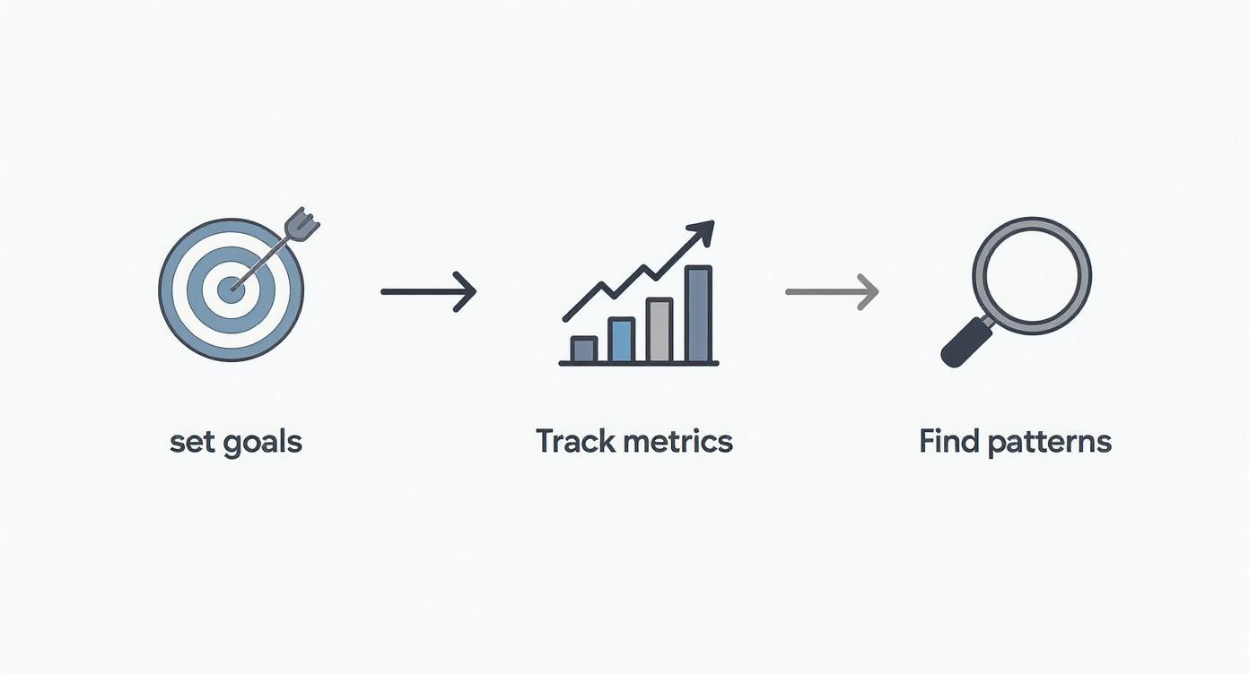
At the heart of it, analyzing your content performance is a pretty simple loop: set goals, track what matters, find the patterns, and do it all over again. This isn't just about crunching numbers; it's about turning your content from a shot in the dark into a predictable way to grow your presence. Every post becomes a learning opportunity.
Moving Beyond Likes and Shares
Let's be real: just throwing posts onto LinkedIn and hoping for the best isn't a strategy. Real growth happens when you get a deep understanding of what your audience actually cares about—and more importantly, why they care.
This guide is designed to cut through the noise. We're going to skip the vanity metrics and zero in on the data that actually moves the needle for your business, whether that’s pulling in qualified leads or cementing your status as the go-to expert in your field.
We’ll walk through a complete, real-world workflow for digging into your content analytics. The goal is to get past the surface-level numbers and uncover the strategic gold hiding in your data.
Before we dive deep, here's a quick look at the roadmap we'll be following. Think of this as the high-level game plan for our analysis.
Your LinkedIn Content Analysis Roadmap
| Stage | Objective | Key Activity |
|---|---|---|
| 1. Set Goals & KPIs | Define what "success" looks like for your content. | Link content efforts to specific business outcomes (e.g., lead gen, brand awareness). |
| 2. Track Metrics | Gather the right data to measure progress against your goals. | Calculate core metrics like engagement rate, CTR, and follower growth. |
| 3. Find Patterns | Identify what's working (and what's not) across your posts. | Segment content by format, topic, and hook to find trends and insights. |
| 4. Experiment & Refine | Use your insights to create better content next time. | Run A/B tests on formats and hooks to validate your findings. |
| 5. Report & Repeat | Turn your analysis into an actionable, repeatable process. | Build a simple report and create a feedback loop for continuous improvement. |
This table lays out the core stages, but the real magic is in how they all connect.
The Content Analysis Flywheel
Your analysis shouldn't be a one-off task you dread every month. It needs to be a continuous cycle of learning and improving. This is what I call the content analysis flywheel.
See how each stage feeds the next? It’s all about building momentum. The insights you pull from one post directly inform and strengthen the next one you create.
Having a structured approach like this is more critical than ever. As of 2025, a staggering 91% of global brands are all-in on content marketing. Yet, the shocking part is that only 29% of marketers feel they can effectively measure its ROI. That’s a huge gap between creating content and understanding if it's actually working.
Sure, engagement rate is the top metric for 64% of teams, but to get the full picture, you have to look wider.
The biggest mistake I see in content analysis is treating all metrics equally. A 'like' is a polite nod. A 'comment' is the start of a conversation. And a 'save'? That's someone telling you your content is so valuable they need to come back to it. Prioritize the metrics that actually line up with your biggest business goals.
For example, raw impressions on LinkedIn are great for getting your name out there, but they don't tell you if your message is landing with the right people. The real magic happens when you pair high impressions with a strong engagement rate. Your job is to connect those dots—to figure out what the numbers are telling you about what your audience truly wants.
Defining What Success Looks Like for You
Before you even think about opening an analytics dashboard, you need to know where you're going. Diving into data without clear goals is like starting a road trip with no map—you’ll be moving, sure, but you won’t have a clue if you're getting any closer to your destination. To really understand your content's performance, you first have to define what a "win" actually means for your business.

Let's be honest, vague ambitions like "get more engagement" or "increase brand awareness" aren't goals. They're wishes. Real goals are specific, measurable, and tied directly to a business outcome. This is the first, non-negotiable step to turn your content from a creative hobby into a reliable growth engine.
Connecting Content to Business Goals
Every single post you publish should have a job to do. The trick is to translate those big-picture business objectives into tangible content goals you can actually track. When you nail this alignment, your analysis will give you actionable insights, not just a pile of disconnected numbers.
Think about what your business is trying to achieve this quarter.
Business Goal: Increase the sales pipeline.
- Content Goal: Generate 20 qualified demo requests from LinkedIn this month.
- KPIs to Track: Click-Through Rate (CTR) on demo links, form submissions, and qualified leads.
Business Goal: Establish authority in your niche.
- Content Goal: Grow your follower count by 10% this quarter.
- KPIs to Track: Follower growth rate, reach, and impressions.
Business Goal: Build a stronger community around your brand.
- Content Goal: Increase average comments per post by 25%.
- KPIs to Track: Comment volume, comment quality, and reply rates.
This simple exercise shifts your content from being "just out there" to having a clear purpose. Suddenly, you know exactly which metrics matter because they're directly connected to the outcomes you actually care about.
The best content strategies are always built on a foundation of clear, measurable objectives. When your content goals line up with your business goals, every metric you track tells a piece of a much larger story about your company's growth.
Setting Your Key Performance Indicators
Once your goals are locked in, it's time to pick the Key Performance Indicators (KPIs) you'll use to measure progress. A KPI for a lead generation goal—like CTR on a demo link—is totally different from a community-building goal, where comment volume is king. Your KPIs become the lens through which you see your content's performance.
This is a fundamental concept that goes way beyond social media. To really define success, it helps to understand how to measure SEO success on a broader scale, since the principles of setting clear, trackable goals are universal.
For a deeper dive into this, you can learn more about how you measure success on LinkedIn right in our FAQ section. With your goals and KPIs established, you’re finally ready to look at the data.
Decoding Your LinkedIn Analytics Dashboard
Staring at your LinkedIn analytics dashboard can feel a bit like trying to read a foreign language. You’ve got a screen full of numbers, charts, and percentages, but without context, it's just noise. The real trick to analyzing your content performance is learning the story each metric is telling you.
Let’s start with the most common one: impressions. This simply counts how many times your post was shown in someone's feed. Think of it as your potential reach. It’s a decent top-level number, but it doesn't tell you if your content actually landed with anyone.
That’s where engagement rate comes in. This is your reality check. You calculate it by dividing your total engagements (likes, comments, shares) by your total impressions. It shows you what percentage of people who saw your post cared enough to do something about it. A huge impression count with a tiny engagement rate is a big red flag—your message just isn't connecting.
Looking Beyond the Like Button
Here’s something I’ve learned over the years: not all engagement is created equal. To really get what resonates with your audience, you have to look at the quality of the interactions, not just the quantity.
A like is a simple nod. It’s a low-effort tap that shows someone appreciates your post, but it doesn't mean they were deeply moved by it.
A comment, on the other hand, is a conversation starter. It takes more effort and signals that your content was thought-provoking enough to get a response. Honestly, a post with a few dozen thoughtful comments is often way more valuable than one with hundreds of likes because it's actively building a community.
The most underrated metric on LinkedIn, hands down, is the save. A save is a powerful signal. It means your content is so valuable that someone is bookmarking it for later. This is how you know you've created true pillar content that serves as a resource, not just another fleeting thought in their feed.
To make this easier, here's a quick-reference table that breaks down the key metrics and connects them to the goals they help you measure.
LinkedIn Metrics: What They Mean and When to Use Them
| Metric | What It Measures | Best For Goal |
|---|---|---|
| Impressions | How many times your post was displayed in a user's feed. | Brand Awareness, Reach |
| Engagement Rate | The percentage of viewers who interacted with your post (likes, comments, etc.). | Content Resonance, Audience Connection |
| Click-Through Rate (CTR) | The percentage of viewers who clicked a link in your post. | Driving Traffic, Lead Generation |
| Comments | The number of direct replies to your post. | Community Building, Starting Conversations |
| Saves | The number of times users bookmarked your post. | Content Value, Authority Building |
| Follower Growth | The increase in followers after a post is published. | Audience Expansion, Influence |
Think of this table as your cheat sheet. When you're setting your goals for the month or quarter, come back to this to make sure you're tracking the numbers that actually matter for what you're trying to achieve.
Understanding Action-Oriented Metrics
While engagement metrics tell you about connection, other numbers show you how well your content drives action. The Click-Through Rate (CTR), for instance, is absolutely critical if your goal is to get people to your blog, a landing page, or a product demo. It measures the percentage of people who saw your post and actually clicked the link.
Similarly, keeping an eye on follower growth after a particularly successful post can show you that your content isn't just entertaining your current audience—it's attracting new people to your profile. It's a clear sign your influence is expanding.
Of course, these metrics all live in a larger ecosystem. For a more complete view, it's helpful to see how they fit into a broader framework. A complete social media analytics dashboard guide can offer a wider perspective across all your channels.
Ultimately, you’ll start to see how these numbers are connected. You might notice a strong link between posts with high saves and those that also drive follower growth. It's also worth digging into the nuances, like the difference between views vs. impressions on LinkedIn, because not all visibility is the same. Getting these details right is what helps you fine-tune your strategy from good to great.
Finding Actionable Insights in Your Data
Staring at your LinkedIn analytics dashboard can feel like drowning in numbers. Impressions, clicks, engagement rates... it's a lot of raw data. But data by itself is useless. The real magic happens when you turn those numbers into a story that tells you what to do next.
This is where we move beyond just tracking metrics and start asking why. Why did one post take off while another one fizzled out? The best way I’ve found to answer that is through segmentation.
It just means slicing up your data into smaller, comparable groups to spot the patterns hiding in plain sight. Instead of looking at your overall engagement rate for the month, you start pitting different types of content against each other.
This is exactly what we designed the PostFlow analytics dashboard to do—give you a quick, visual way to compare what's working.

You can see instantly which post formats are pulling the most weight, which helps you stop guessing and start making decisions backed by your own data.
Segmenting Your Content for Deeper Understanding
LinkedIn's native analytics are a decent starting point, but they don't make it easy to do this kind of deep-dive comparison. This is where a third-party tool really shines by laying everything out for you. The key isn't the tool, though—it's knowing which questions to ask.
Start by bucketing your posts into logical categories. Think about it like this:
- By Format: Are my videos getting more love than my text-only posts? Do people save carousels more often than single-image posts?
- By Topic Pillar: I talk a lot about leadership, marketing, and productivity. Which of those pillars consistently gets people talking in the comments?
- By Hook Type: Do my posts that open with a personal story get more traction than the ones that lead with a surprising statistic?
- By Posting Time: Does my Tuesday morning content get a bigger initial boost than what I post on Thursday afternoons?
This process—segmenting and comparing—is the absolute heart of effective content analysis.
The goal isn't just to find your single "best" post. It's to figure out the specific ingredients—the format, the topic, the hook—that made it a winner so you can do it again. And again.
From Numbers to Narratives
These days, good content analysis is more than just crunching quantitative metrics. It’s about looking at the type of comments you're getting to understand audience sentiment. It's about using clean charts to tell a compelling story with your data.
In fact, a whopping 53% of marketers now track both social media and website engagement together, showing how important it is to have a connected view of performance. If you want to go deeper on this, there are some great evolving analytics methods worth exploring.
By asking the right questions and slicing up your data, you turn a boring spreadsheet into a strategic roadmap. You stop throwing content at the wall to see what sticks and start building a content engine based on real evidence from your audience. Each segmented report is a clue, and over time, those clues come together to give you a crystal-clear picture of what your audience actually wants from you.
Turning Your Insights into Smart Experiments
All that analysis is great, but let's be honest: analysis without action is just an academic exercise. Once you’ve sliced and diced your data and started to get a feel for why certain posts hit differently, it's time to put those insights to work. This is where you go from passively observing your performance to actively shaping it.
The whole process starts with a simple teardown of your posts. I'm not talking about just glancing at the final numbers. I mean treating your best-performing content like a winning formula you need to reverse-engineer, piece by piece.
And for the posts that flopped? It's the same deal, but in reverse. You're not just calling it a failure; you're doing a post-mortem to figure out what went wrong so you don't repeat the mistake.
Deconstructing Your Wins and Losses
Let's say you published a carousel that absolutely crushed it on saves. Don't just pop the champagne—dissect that thing. You need to ask yourself some sharp questions to figure out which parts you can use again.
- The Hook: What was the first slide? Did you lead with a controversial take or a relatable story that pulled people in?
- The Visuals: Was the design clean? Easy to read on a tiny phone screen? Maybe a specific color palette made it pop in the feed.
- The Call-to-Action (CTA): Did you ask a direct question on the last slide that got people talking in the comments?
Now, flip it. Think about a text-only post that fell completely flat. Minimal engagement, crickets. Instead of just archiving it and moving on, diagnose what went wrong. Was the opening line too bland? Was it just a dense wall of text that nobody wanted to read? Every answer is a clue.
The point here isn't to perfectly clone one successful post. It’s about building your own personal playbook of proven tactics—the hooks, formats, and angles that you know, for a fact, resonate with your audience.
Launching Small, Strategic Experiments
Your little diagnostic sessions will naturally spark some ideas. You'll start forming hypotheses, like, "I have a hunch that posts starting with a personal story get way more comments." An experiment is just how you prove (or disprove) that hunch.
This doesn't have to be a massive, complicated research project. Simple A/B tests are incredibly powerful for dialing in your strategy.
An A/B test is really just a head-to-head comparison. You test two versions of one thing to see which one performs better. By changing only a single element at a time, you can be pretty confident that any performance difference is because of that specific change.
Here’s a dead-simple framework for running your own content experiments on LinkedIn:
- Isolate One Variable: Pick just one thing to test. It could be the hook, the post format (text vs. image), or even the time you post.
- Create Two Versions: Write two posts that are identical except for that one variable. For example, Post A starts with a question, and Post B starts with a statistic. Everything else is the same.
- Publish and Measure: Post them at similar times but on different days so they aren't competing with each other. Keep a close eye on the one metric that matters for your goal (e.g., comments for an engagement test, CTR for a traffic test).
- Analyze and Document: After a few days, compare the results. Write it down somewhere. A simple log like, "Hypothesis: Question hooks get more comments. Result: True. Post A got 35% more comments," is perfect.
This experimental mindset is what separates the pros from the amateurs. It turns your content analysis from a backward-looking report card into a forward-looking tool you can use to get better and better over time.
Building Repeatable Reports That Drive Action
Analysis without action is just an academic exercise. The whole point of digging into your content performance is to figure out what to do next. This is where you turn raw data into a strategic roadmap.
It’s about creating a simple, repeatable system that closes the loop—transforming your analysis from a backward-glancing chore into a forward-looking tool that actually improves your content.
Forget about those dense, multi-tab spreadsheets that nobody has time to read. Your goal here is a concise, scannable report that tells a clear story. I’m a big fan of a simple one-page summary, updated either monthly or bi-weekly, depending on your posting cadence.
The One-Page Performance Snapshot
Your report needs to be built around three core parts that get the message across quickly. The structure should be so clear that anyone, from a stakeholder to a new team member, can grasp the key takeaways and understand the game plan in just a few minutes.
Here’s what I recommend including:
Key Metrics Dashboard: Start with the high-level view. Show the current period's numbers for your main KPIs—think impressions, engagement rate, and follower growth. The magic touch? Include the percentage change from the last period. This immediately answers the big question: "How are we doing?"
Top Performers & Key Learnings: This is where you highlight your top 2-3 posts. But don't just list them. Add a short "Why this worked" summary for each one. For example: "Our carousel on productivity tips had a save rate 40% above average, which tells us our audience is hungry for actionable, step-by-step guides."
Actionable Next Steps: Honestly, this is the most critical part. Based on what you just learned, create a short, concrete action plan. This is how you turn insights into actual assignments.
A report without a clear action plan is just trivia. The goal isn't to present data; it's to use data to decide what to do next. Your report should always end with a list of specific, measurable actions for the upcoming period.
Turning Learnings Into Action
This is where your analysis truly pays off. Your action plan shouldn't have vague goals; it needs to be a direct response to what you found in your performance review. It's about specific tasks that double down on your successes and shore up your weaknesses.
For instance, your plan might look something like this:
- Create two more carousel posts based on our top-performing format, this time focusing on common customer pain points.
- Test three new hooks that lead with a personal story, since that style drove the highest comment volume this month.
- Repurpose our top video post into a text-and-image format to see if we can get similar results with a different medium.
This creates a powerful feedback loop. You analyze, you report, you act, and then you measure the results of those actions in your next cycle. It’s how you build a content strategy that gets consistently better, one report at a time.
A Few Common Questions I Hear All The Time
When you start digging into the numbers, a few questions always pop up. Over the years, I've seen clients and colleagues get stuck on the same handful of things, so let's clear them up right now.
How Often Should I Be Doing This?
Don't get lost in the daily noise. My go-to rhythm is a monthly deep-dive to spot real trends and a quick weekly check-in on your most recent posts.
This keeps you agile enough to react to what’s working (or not working) without getting bogged down in analysis paralysis.
What’s a "Good" Engagement Rate on LinkedIn?
Sure, the industry benchmark often sits around 2-5%. That's a solid number to keep in the back of your mind.
But here’s the truth: the only benchmark that really matters is your own. The real goal is to consistently beat your own average. If your engagement was 1.8% last month, aiming for 2.2% this month is a huge win.
I'm Overwhelmed. Where Do I Even Start?
If you only look at one thing, make it your engagement rate.
Why? Because it’s the most honest signal you have. It tells you, point-blank, whether your content is actually connecting with people. A high engagement rate means your message and format are hitting the mark, no matter how many followers you have. Nail that, and the rest will follow.